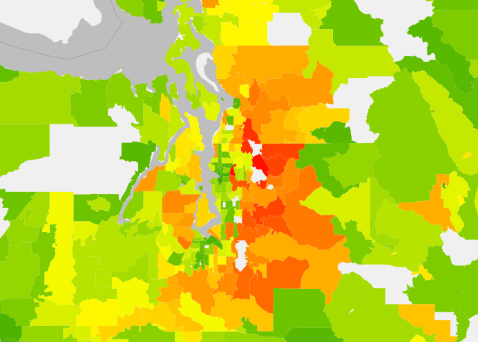
Map of the Week: Average Annual Household Carbon Emissions
We are a carbon-based society. Our daily lives are built around our ability to acquire and consume goods, produce things, move freely from one...
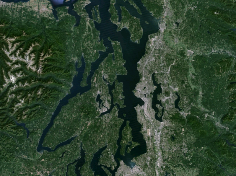
The Coming of Climate Change and Mass Inundation of the Puget Sound
Scientists tells us that global temperatures are likely to rise somewhere between 2.7°F to 8.6°F by the end of the century. It's a bit of...
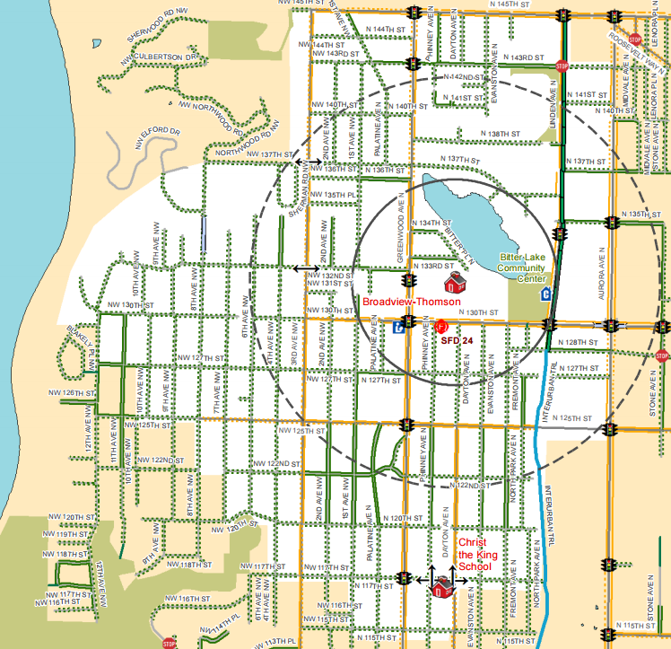
Map(s) of the Week: Safe Routes to School Maps
For many parents, getting their children to and from school safely is an issue of deep concern. Now parents have a new tool at...
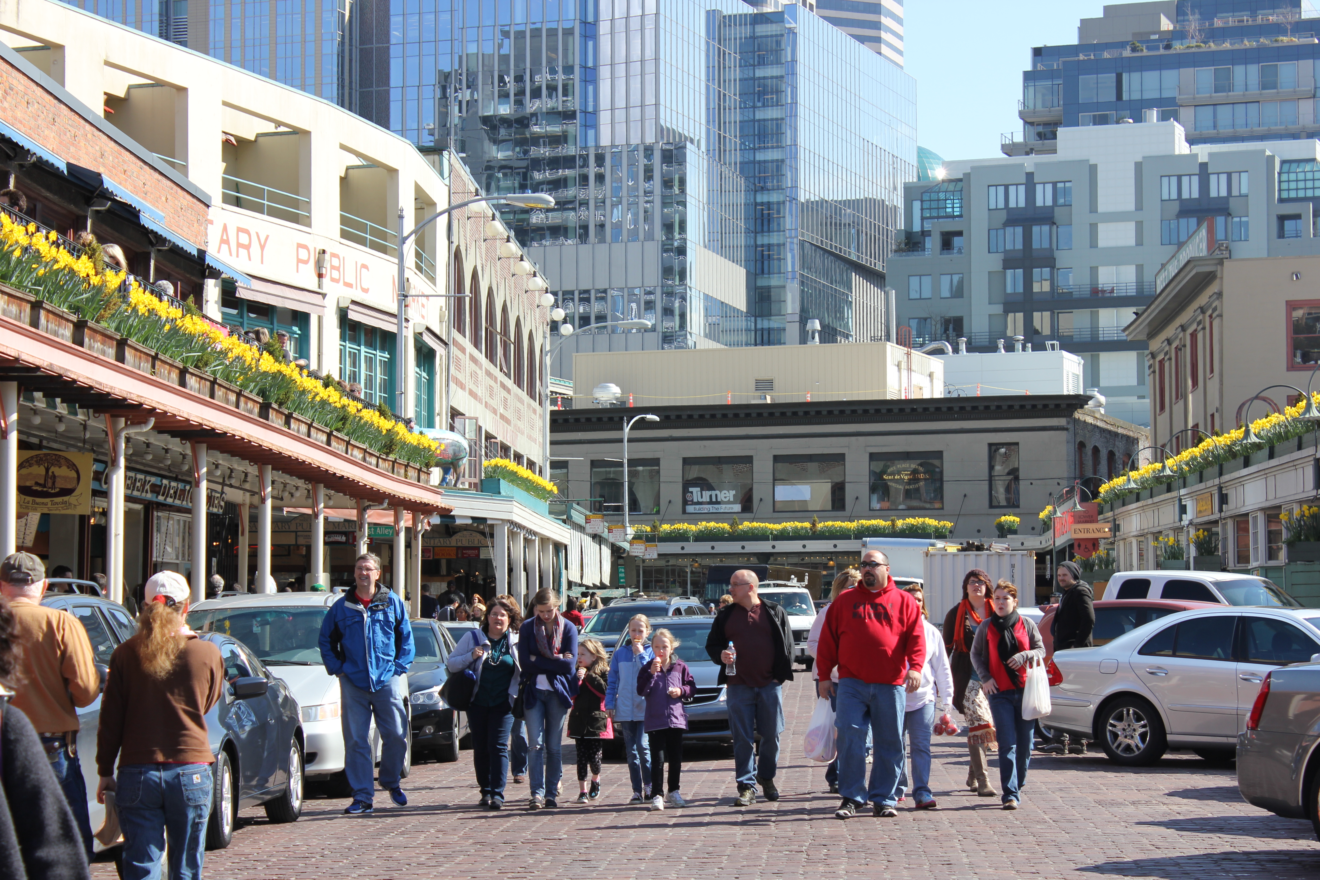
Observing People in Pike Place, Part 2
Article Note: This is the second installment in a series on observations of people in Pike Place. See Part 1 for a brief background of public...
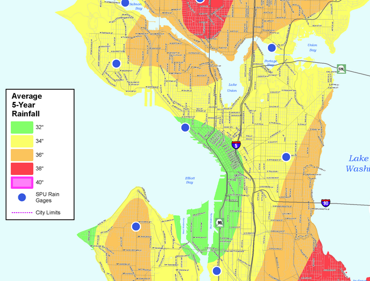
Map of the Week: Rainfall Across Seattle Neighborhoods
Some places in Seattle are wetter than others, according to new data from Seattle Public Utilities. SPU recently released a map showing variations in...
Observing People in Pike Place, Part 1
Article Note: This is the first installment of a series on observations of people in Pike Place. Part 1 focuses on existing design features...
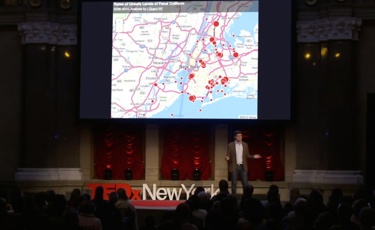
Sunday Video: The Value of Data Sharing
Releasing data captured by government agencies in an accessible way to the public, has the potential to produce interesting insights about city life. Ben...
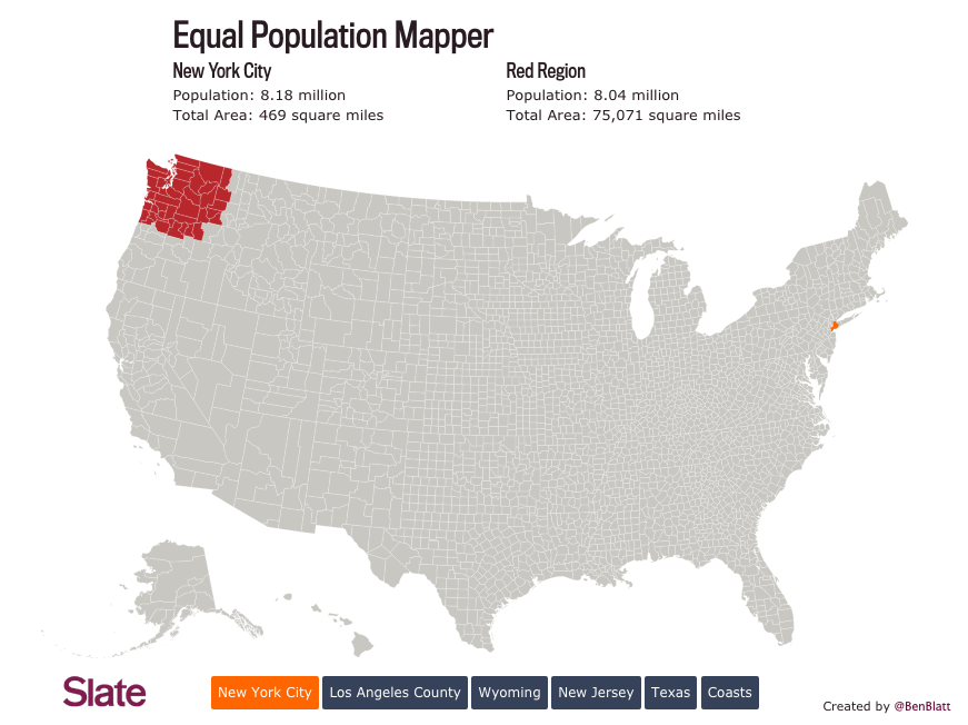
Map of the Week: Equal Population Mapper
The good folks at Slate introduced a creative mapping tool, dubbed the Equal Population Mapper. This interactive graphic allows users to pick a population...


