The code provision that prevents the city from looking like Blade Runner.
In most American cities, the tenants of downtown skyscrapers have their names written across the skyline. Every tower in Los Angeles seems to be labeled by a bank icon or expensive consulting firm. Chicago buildings that aren’t matte black boxes have logos facing out all sides. And there was some irritation when General Electric’s sign came down from New York’s Rockefeller Center and was replaced by Comcast’s name and the bright NBC peacock logo.
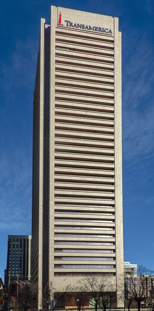
Skyscraper signs reach new heights of absurdity in Baltimore, where the tallest building has a sign featuring San Francisco’s second tallest building. Insurer USF&G constructed its Baltimore waterfront headquarters as an urban renewal project in the 1970’s, without labeling the tower. That changed when the building was acquired first by Legg Mason in the 1990’s, then by Transamerica in 2011. Their icon is the famous Transamerica pyramid. Now another city’s tower is higher than anything else in Baltimore, and yet 300 feet shorter than the original San Francisco structure.

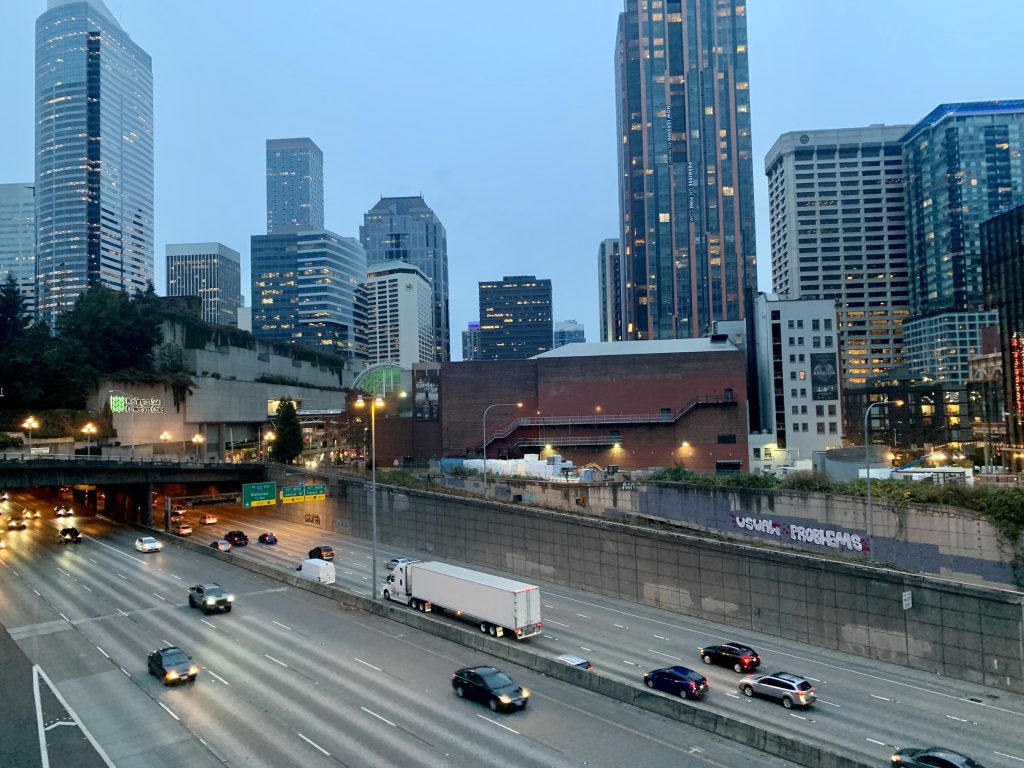
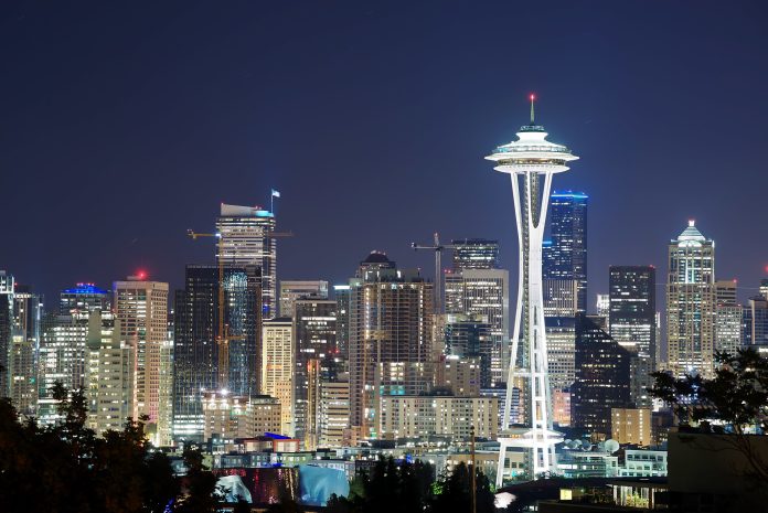
But that’s not going to happen in Seattle for a reason that’s kind of simple yet weirdly elaborate. Seattle’s sign code prohibits skyscraper signs in absolutely clear terms.
23.55.034.C.5 - No portion of any on-premises or off-premises sign shall be located more than sixty-five (65) feet above the elevation of the sidewalk at the street property line closest to the sign.
Easy enough. Seattle simply does not permit signs installed over five stories from the ground on downtown buildings. The code goes on to prohibit electronic displays over a very minimal size and moving or flashing signs. Of course, this is part of the City’s ordinance. So such unequivocal statements are buried in exceptions.
First, the code specifically states that public buildings and hotels are exempt from the rule. Most famous is the Roosevelt Hotel with its neon roof sign being slowly engulfed by surrounding new towers. The nearby Sheraton at the Washington State Convention Center and the Hilton off I-5 also take advantage of the code and loft their logos to the top of their buildings. As a public building, the Convention Center and its sign over the interstate, are exempt.

Second, the building sign prohibition only applies to downtown zones. The code refers to separate rules for special districts like Pioneer Square and historic districts like Pike Place Market. The particular rule does not apply to two other very notable building signs — Lumen Field and T-Mobile Park — because the stadiums are zoned industrial.
In years past, there were discussions to permit signs on downtown towers. Most recently in 2010, the City Council considered allowing illuminated signs at the top of skyscrapers with constraints that would have limited them to six or seven buildings. The proposal was tabled after pushback from preservationists and architects who suggested that it would “vandalize” downtown or make the city into a “logo forest.” Then councilmember Mike O’Brien defended the proposal, but added, “I can appreciate the fear of the city turning into a Blade Runner world.”
Hyperbole is part of the trade in politics, so there was very little chance that a couple brand logos on tall buildings would transform the city into Blade Runner’s dystopian vision of tower-high advertisements. But the conflict emphasizes where aesthetic regulations like the sign ordinance start to play favorites. Few objected when buildings lit up “12” during the Seahawks Super Bowl run. It may have felt like civic pride, but it was an advertisement for a private corporation valued in the billions of dollars.
For every person who finds Blade Runner to be a hellscape, plenty of others find it very cool. Other cities are allowing modern lighting displays to cover entire building facades, even coordinating shows across many towers. But that cannot happen here. Seattle’s prohibition on labeled skyscrapers and certain types of displays has been an absolute success in setting the look of the city. A very low-key, conservative look. Moving into the future, how much that aesthetic should be maintained is an open question.
Ray Dubicki is a stay-at-home dad and parent-on-call for taking care of general school and neighborhood tasks around Ballard. This lets him see how urbanism works (or doesn’t) during the hours most people are locked in their office. He is an attorney and urbanist by training, with soup-to-nuts planning experience from code enforcement to university development to writing zoning ordinances. He enjoys using PowerPoint, but only because it’s no longer a weekly obligation.


