As summer turns to fall, so turns our lives from a season of sunny exuberance to one of cool reflection. Vacation is over and it’s time to get serious. So it is with the American Institute of Architects (AIA) Honor Awards for Washington Architecture, we’ve had our fun and now its time to measure up. It’s an event to reflect on our growing city and how it has changed in the last year. Or rather, a pause to note the best of the new in a city that is awash with new. And in the sorting of the great from the pretty good and the just okay (and the let’s not talk about it), a chance to ponder our values, aesthetic and otherwise, and think about they can and do manifest in our built environment.
Does our commitment to climate change show up in how what we build function? Are our desires for a civic discourse expressed in new common spaces that welcome everyone? Do we believe our city should be beautiful and whose definition of beauty are we using?
The entries for the awards run that gambit from single-family and mixed-use to public buildings and conceptual projects. For my purposes, I am just going to focus primarily on a selection of private (and one nonprofit) residential and office buildings because that is what is shaping our city more than anything today.
There is a history of Seattle called “Sons of Profits“, because that was what the early White settlers of Seattle cared about. That is why there is no Seattle Central Park or grand public spaces, nor public waterfront. And that is what is driving our growth today: the global tech economy’s thirst for talent and private developers responding.
The neighborhood of South Lake Union has been nearly entirely rebuilt almost exclusively though private development and with minimal new public spaces. Northgate, Roosevelt, and the University District are facing massive redevelopment as a tidal wave of new housing and offices open and very little new public infrastructure is being added. What we get instead is a series of small semi-public spaces and the street itself, which when done well is the ultimate public space.
Below are a selection of entries that I found interesting or that have some quality worth discussion. The judgements are my own and while I am an architectural designer, I make no claim of expertise. If you have your own thoughts, I would encourage you to share them in the comments.
The Shea
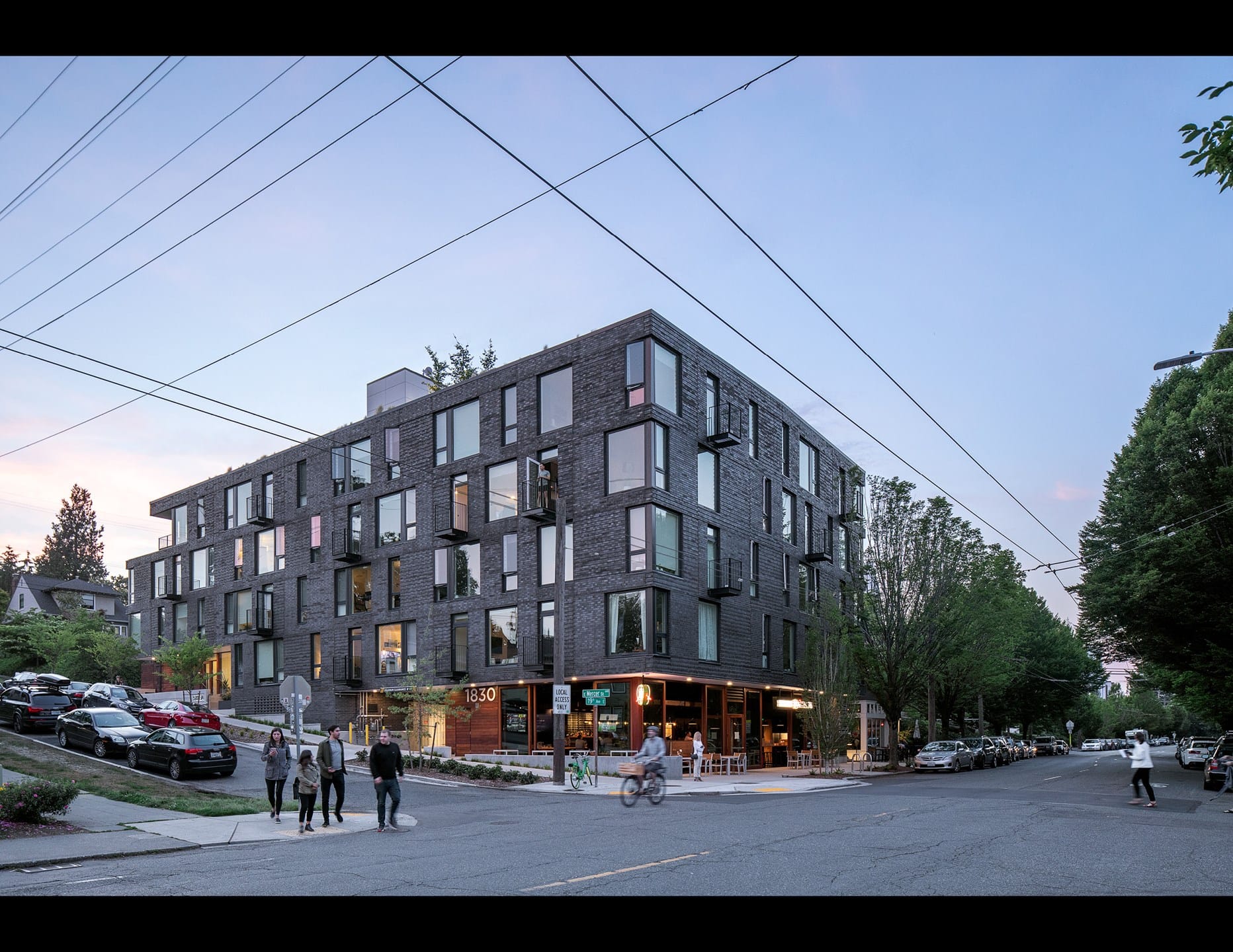
The Shea is a small and simple building like many in this city. But unlike many new buildings, it shows a great deal of restraint and manages to be both boldly contemporary and yet blends in with the older neighborhood buildings surrounding it. It does this by choosing one quality material and celebrating it, where as many newer buildings choose a poor material (Hardie), use many colors and patterns of it, and try to lessen the scale of the building by breaking it into as many small pieces as possible.
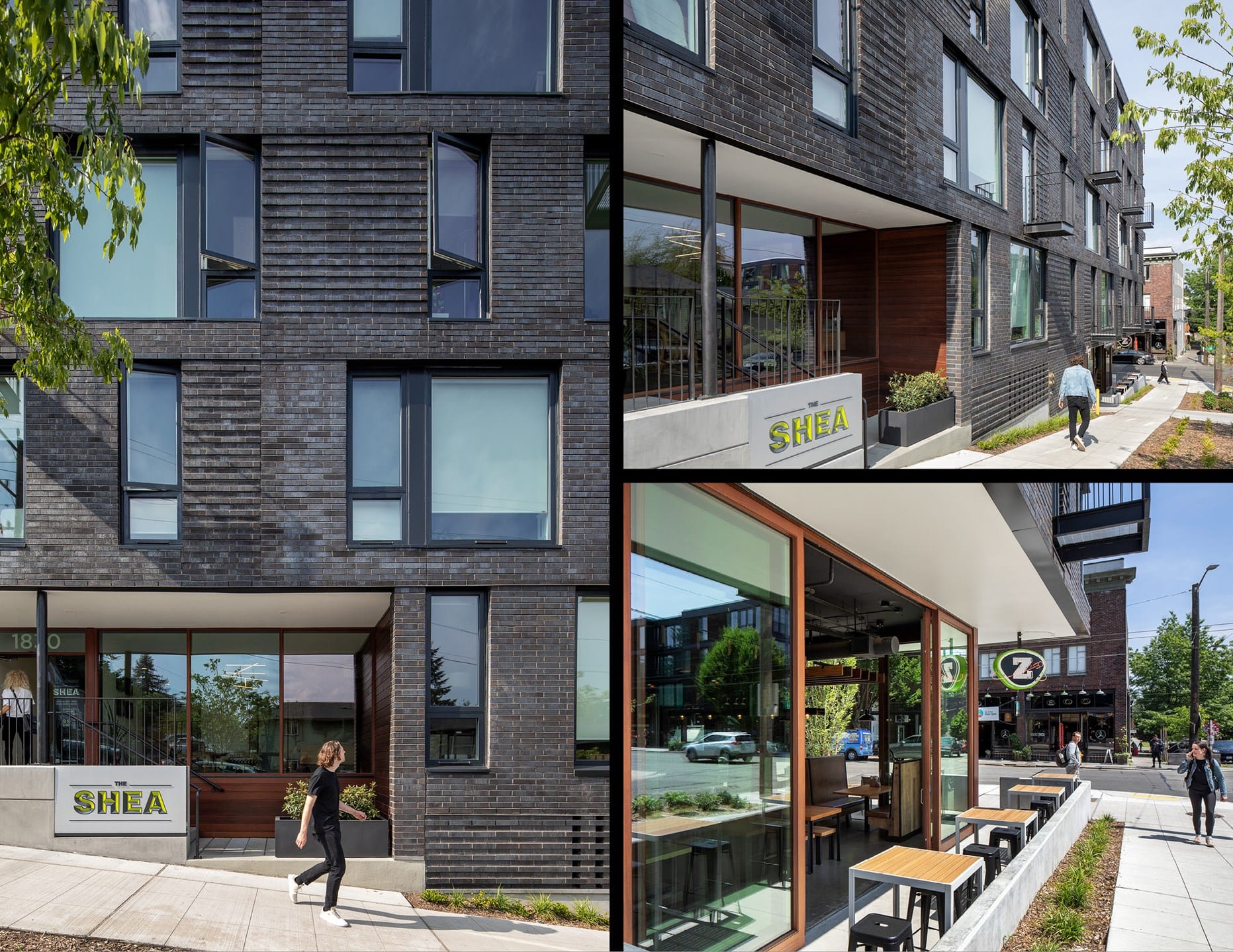
The designers of this project use brick, a common material found in many of our heritage buildings, for the main mass. They opt for a relatively flat and unmodulated facade, choosing instead to employ a dynamic window pattern and changes in the pattern of the brickwork to give the building life. They then use wood in the retail and entry areas to highlight them and provide warmth. It creates a wonderful street edge that supports the growing 19th Avenue commercial district. If only every new building was so nice.
Sitka
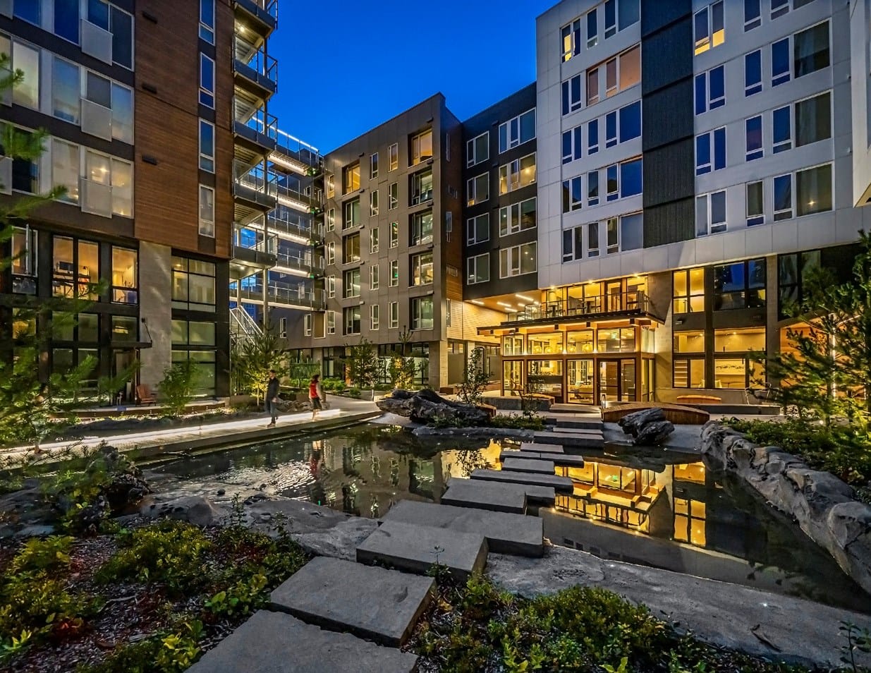
I often think architecture is like cooking: there are ingredients, a cook/designer, and in the end, a thing for the world that should be both creative and satisfy practical consideration. With that in mind, when I saw this building, I was reminded of a well know pizzeria in Portland with a strict limit of three toppings per pie, because this building has too many toppings.
Credit to the architects for trying very hard to imbue the design with meaning and taking inspiration from the environment of the Northwest, but does a building need to have each facade inspired by a different natural element? Does each facade need five plus different materials used in three different ways? I think the (admittedly smaller) Shea apartments above says otherwise. Sitka speaks to Seattle’s fear of bigness: This is a full block project, but rather than let it be that we insist that it be broken into smaller pieces because that is what the city has decided constitutes good urbanism. The block to the north, Stack House, uses all the same tricks to achieve the same mediocre results. Nevermind that there are large buildings in cities throughout the work that read as one big object while maintain a simple elegance.
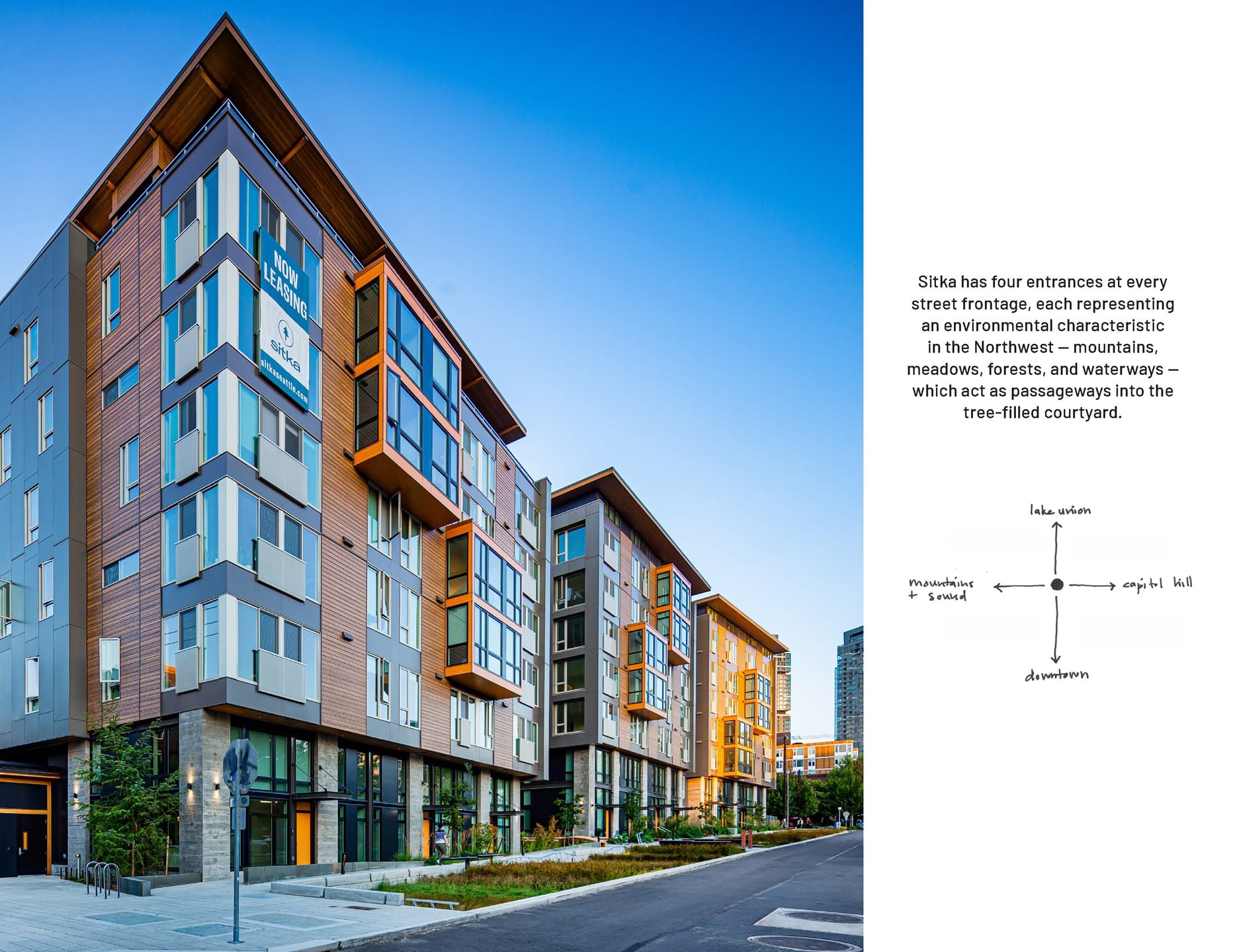
That all being said, the Sitka is also better than most new buildings, creating a lush interior courtyard for its well healed residents, and providing generous sidewalks with abundant plantings. It also claims to be “one of the most sustainable and energy efficient multifamily buildings in the region.” It includes sustainable features such as Wastewater Heat Recovery system that captures heat from outgoing wastewater and reuses it for domestic hot water heating and a greywater harvesting system that diverts water from showers and laundry for on-site irrigation. The project has also achieved LEED for Home Platinum and Salmon Safe certifications.
Arbor Blocks
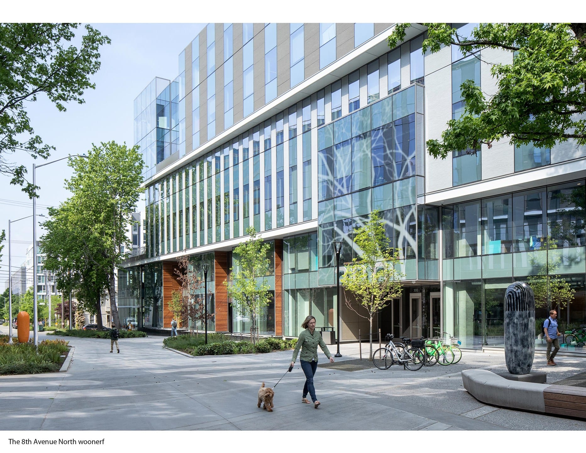
At first glance, these two buildings are unremarkable South Lake Union tech office buildings. On second glance, they are as well. Not that they are bad, they are quite handsome, and they are definitely tech being home to several thousand Facebook employees, they just don’t jump out at you. But what is interesting is the space between.
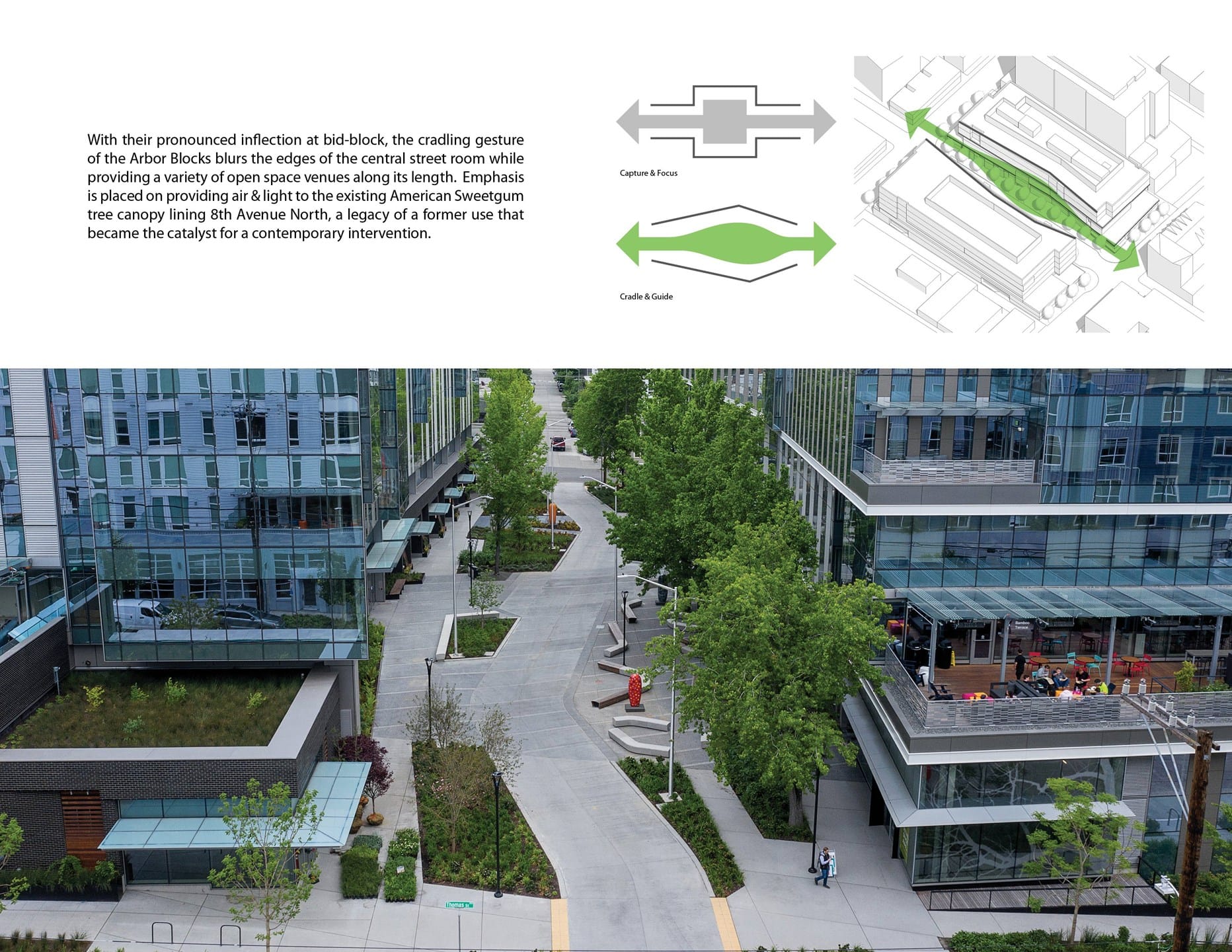
The developer chose to transform a block of 8th Avenue into a meandering street where pedestrians and cars share the space, a woonerf in planner speak. The street has been reduced to one lane, raised to sidewalk level and paved using concrete, and planting (including bio-retention planter that help clean street runoff) and seating greatly expanded to give a park-like feel. Even the building has a subtle concave form that enlarges the public space mid-block. It appears more successful as a public space than the woonerf portions of Bell Street, which is actually a park. And in one of our regions fastest growing neighborhoods. And one that lacks a lot of public space, this is a great addition.
Data One
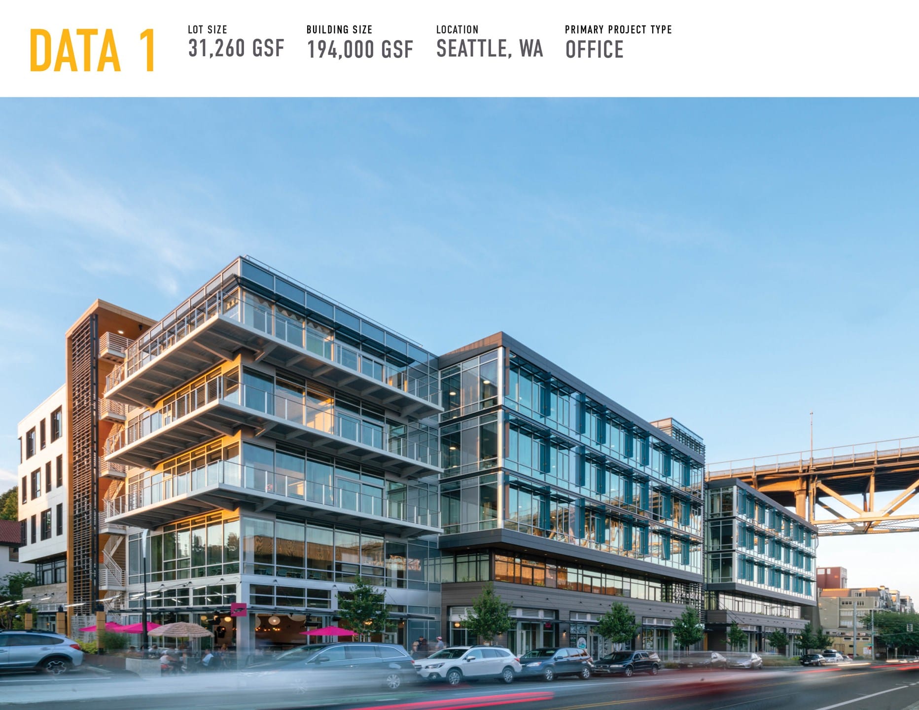
Data One is another tech office building, this time in Fremont and occupied by Tableau. Like the Arbor Blocks, this project it is an attractive building in a techno-environmental fashion. It is glass and steel modernism but with sun shades that let you know they did a lot of environmental modeling, which seemed to pay off in a LEED Gold Core and Shell certification.
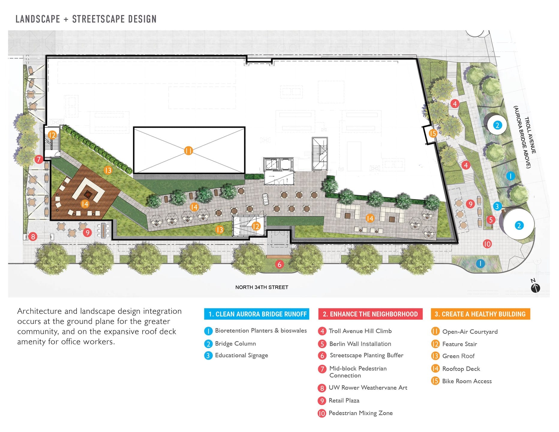
The building has large operable windows and courtyard to maximize natural light and ventilation, and a highly visible stair designed to encourage people to walk between floors. But as with the Arbor Blocks, the most interesting aspect is the landscape. They pulled the building back in many places to expand the public realm and provide more seating, circulation, and plaza space, including a Troll Avenue hill climb and new mid-block pedestrian crossing on the west side. They also provided a series of planter strips that treat the tainted stormwater that comes off of Aurora Avenue, one of our city’s great car sewers, providing the ability to remove toxins from over 200,000 gallons of rainwater a year. Quite a feat for one building.
WESCU Plaza
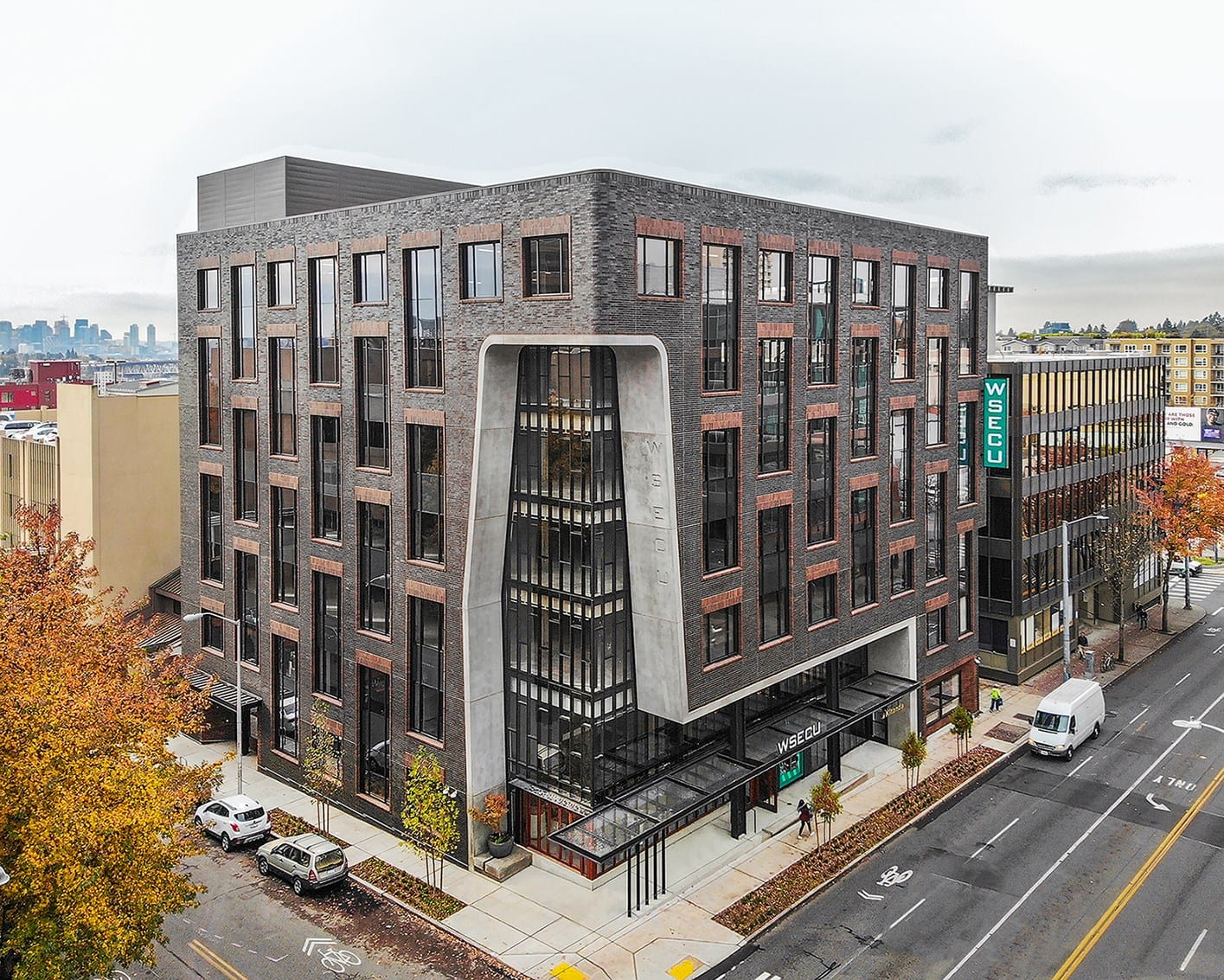
While this building shares many of the same qualities I love in The Shea discussed above, I could not resist writing about it as it is one of my favorite new buildings in Seattle. Like The Shea, it uses quality materials in a subtle way–a dynamic window pattern and two tones of brick–that allow it to be modern yet feel familiar.
But unlike The Shea, the building recognizes its important location at the intersection of NE 45th St and 12th Ave NE and celebrated the corner with a sinuous organic erosion of what is otherwise and simple brick box. This bold move gives the building and the corner a strong identity while also carving into the facade to provide a more generous sidewalk. And speaking of the sidewalk level, while this is a bank building, they have made an effort to negate the often street-killing presence of banks.
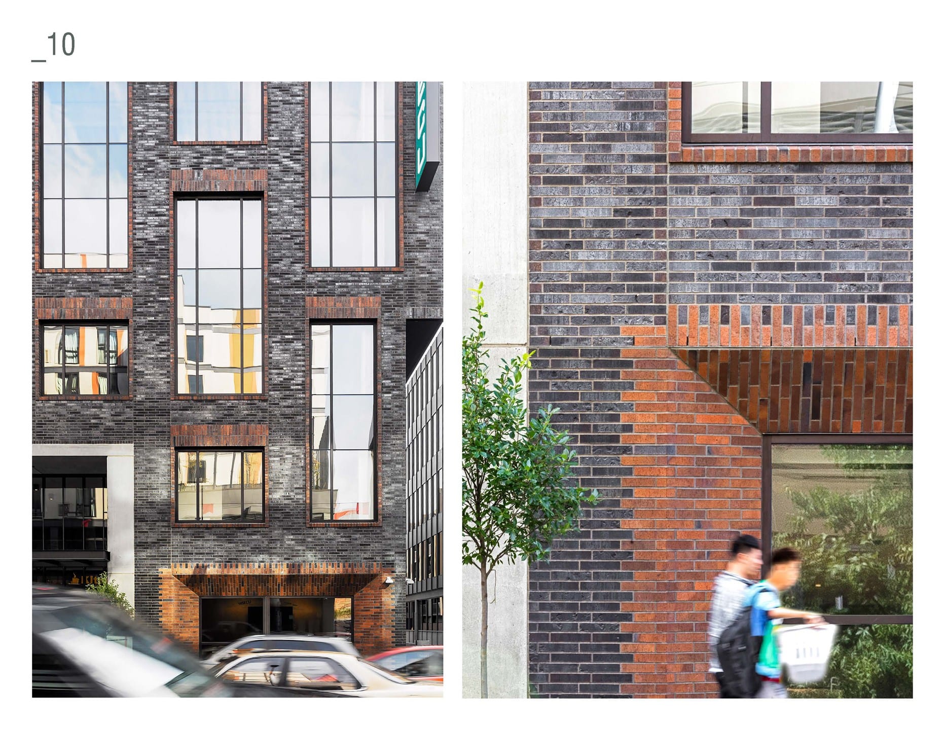
To paraphrase Jane Jacobs, the end state of a street’s evolution is when banks build branches on all the best corners and kill the life of them. To make sure this does not happen, the ground floor is designed to have both a bank branch, and a cafe space and community room that can be open even when bank is closed.
Africatown Plaza
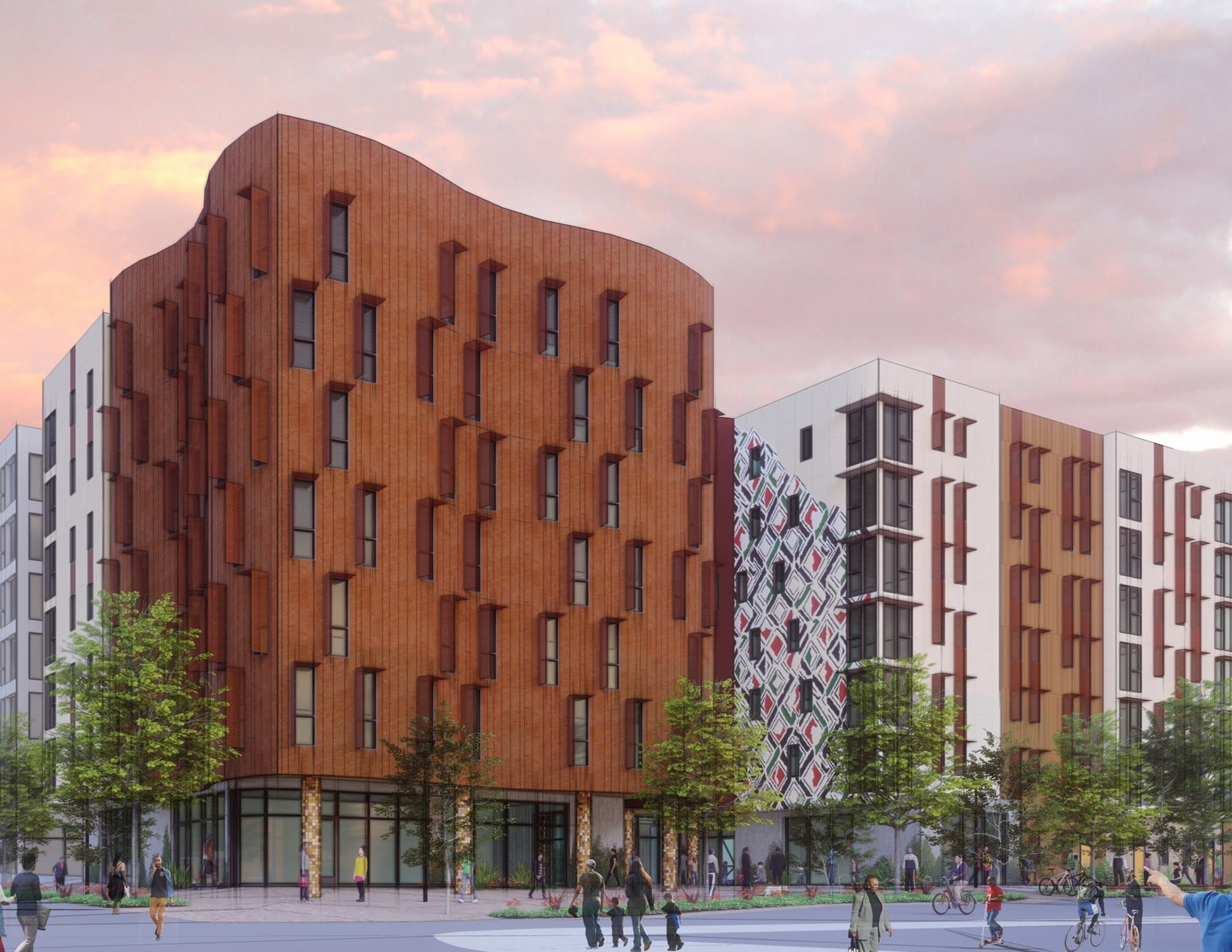
This is a conceptual design of a very different nature than the others above. Rather than reflecting the vision of a developer or architect, this project aspires to reflect the vision of a community. In this case, the African American community of the Central District, where displacement due to rapidly rising housing costs is pushing African Americans to the suburbs or out of the region all together.
The project is the southern slice of Midtown Plaza at 23rd Ave at E Union St. The rest of the block is being redeveloped by for-profit developers, but this piece is being developed into affordable housing and incubator retail by Africatown Community Land Trust.
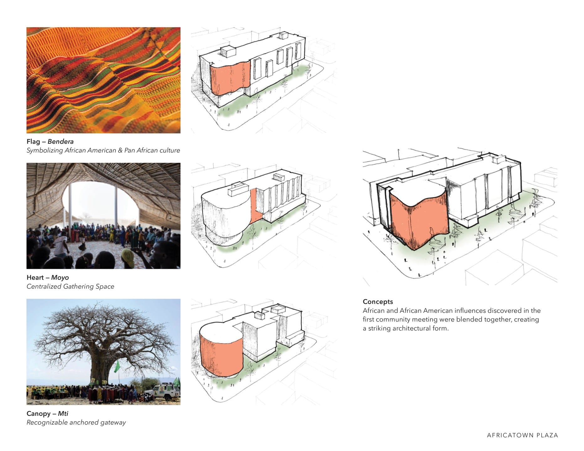
The images show forms and patterns that can be traced to traditional African imagery. While it is yet to be seen how much the final design resembles this, the principle of how to design an Afro-centric building, many gathered through community workshop, will no doubt inform whatever is built on site. This is an ongoing discussion: how do you design a building that reflects the culture of the community while still maintaining a high aesthetic bar and not pandering or essentializing?
In addition to seeking to reflect the community via the building, the vision also includes a community plaza to create a literal place for community whether they live in the building or not. Hopefully we will see a full proposal for this site in the near future that show us how community and culture can be interpreted in buildings.
Upcoming Honor Awards Night
The 2019 Honor Awards will be held November 4th from 5:30pm to 9:30pm at Town Hall Seattle. More information and registration can be found online. Whether you plan to attend or not, the complete gallery of entries can be seen via the online open house. Names of design firms have been withheld at the request of the AIA Seattle.
According the the AIA Seattle, their goal it to “provides the architecture community with resources and relationships to make a difference through design. We open doors, provide connections, keep our members and the public informed, and demonstrate our commitment to great design as the key ingredient for livable, sustainable places.”


