“Beyond a certain critical mass each structure becomes a monument, or at least raises that expectation through its size alone, even if the sum or the nature of the individual activities it accommodates does not deserve a monumental expression.
This monument of the 20th century is the Automonument, and its purest manifestation is the Skyscraper.”
FROM DELIRIOUS NEW YORK BY REM KOOLHAUS
Skyscrapers are curious and contradictory things. They are at once exclusive and egalitarian. They both ignore the city below and are collectively the symbol of it. They are icons of wealth and power (please see the new Amazon HQ), modern day Towers of Babel that compete for height and view and to impress and wow. They cost massive amounts to build and so charge very high rents. I almost never go into them and when I do it’s mainly the Seattle Municipal Tower, or the great DMV in the sky as I call it, one of the few that will welcome you in without a badge.
But then again, how many cities are defined by their skyline? How many cities can you recognize from their skyline alone? Somehow this random collection of glass and steel, the product more of desire for money then civic spirit becomes our symbol as a community. And who amongst us doesn’t enjoy the towers lit up in the night from one of our many hills or shining in the sun from a ferry?
I’m not a sportsball fan, but even I feel a tinge of civic spirit when I see the high rises lit up in team colors. When returning to the city it is when I see the skyline in the distance that I know that home is near. At the same time, when I catch glimpses of it from my neighborhood deep in the Rainier Valley, I always become acutely aware of the vast gap between the skyscraper Seattle of Downtown, rich with tech money, and the just scraping by Seattle of the city’s rapidly disappearing working class neighborhoods. Such strange animals are we.
Love them or hate them, they are a part of our urban fabric. Rem Koolhaus, the architect of the Central Library, writing in Delirious New York, his retroactive manifesto for the New York City, called skyscrapers “auto-monuments” that are essentially devoid of meaning but gain significance through their shear volume.
Skyscrapers are an invention of modern America–the term originated in the late 19th century to describe the new form of building found in the industrializing cities or New York, Chicago and others. In traditional masonry construction the walls at the base have to keep getting thicker as the building gets taller above to support the weight of additional floors, which severely limits the height of buildings. During the industrial revolution steel construction and elevators were brought together and the building type of the skyscraper was born. Their creation has led to levels of density unimaginable for most of human history. They are so new, yet modern cities are unimaginable without them.
Which brings us to Seattle, mid (or is it late?) boom. According to the Downtown Seattle Association, today 313,000 people work and 88,000 people live in greater downtown. And according to the Seattle Skyscraper City forum, 30 skyscrapers have been completed since 2014, 21 are currently under construction, and 55 are in various stages of planning–with the University District starting to get more involved. With all this vertical expansion, issues have been raised about what we want to see in our skyline.
Highrises are built on the most expensive land and require the most costly construction type which typically leads the sky to be the domain of the rich–save where the government intervenes. While a proposed project on First Hill will reach the unheard of height for a modern Seattle affordable housing building of 13 stories, it is considered radical for such a project reaches so high. It doesn’t have to be that way. Dense affordable housing in the center of the city would allow many of the people who make our city function every day live near their work. The downtown skyline can be for the people as well, we just need to have the will to make it so.
One of the many contradictions of tall buildings is that they exist as two separate things. As a viewer from a far, it is only the bulk of the building that is visible in the sea of skyscrapers that matters. But as a person on the street, the vast majority of a tall building is nearly imperceptible. So, for the most people, what really matters is the first couple of floors. It is this we must focus on, making sure that no matter what happen 30 stories above, that the street is active and porous and that we are not building gated communities cut off from the life of the city.
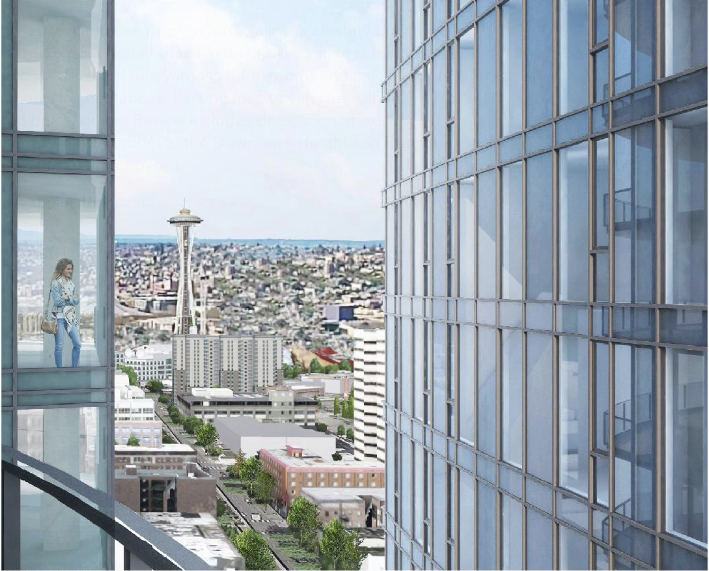
Then there is the perennial issue of tower spacing or how dense is too dense. This issue was covered in The Urbanist in 2016 in an in depth article by Anton Babadjanov. The basic question is what provisions do we as a city want to require to protect light and privacy between buildings? The idea is that once a building is constructed it is then surrounded by a bubble where no other highrise can be built. Some see it as a key livability issue, while others see it as a limitation on the density of the center city. Many an appeal has resolved around this issue.
Many people lament the sameness of many of the building being constructed. Most are what I refer to as extrusion buildings–it’s as if a shape was drawn and then pushed through a Play-Doh Fun Factory to 40 floors. This is a very functional way to build and makes sense from a structural perspective, and in the hands of skilled designers they usually end up with a simple elegance. But many of the new highrises have moved beyond this and are striving for a more sculptural quality be it the sinuous curves of 1200 Stewart, or more expressiveness within an angular form such as on Nexus, or the subtle tensions achieved by 707 Terry.
At the end of this cycle the skyline will be very different from what it was as the recession ended. I do not mean this in just a quantitative sense. The new highrises are in many cases a departure stylistically from what existed before. What follows is are a few examples of what has been added, what is underway and what we may yet see before this is all over.
F5 building
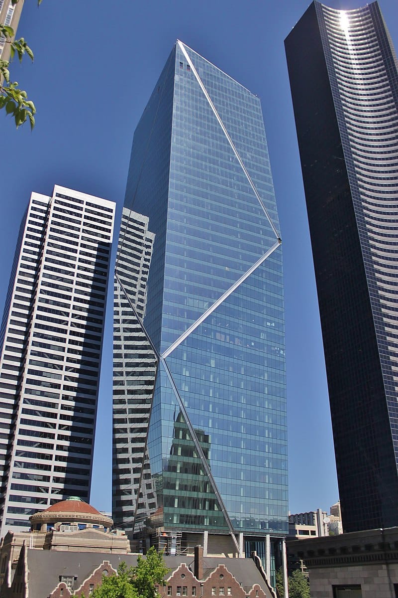
This is my favorite building completed thus far in this cycle. The 43-story F5 building contains both 798,000 square feet of office space and a hotel. It also did this while restoring the sanctuary of the historic First United Methodist Church. It is elegant and sculptural, using subtle plane shifts and an expressive angular crown to make the building appear like a shard rising from its stone face plinth.
Insignia
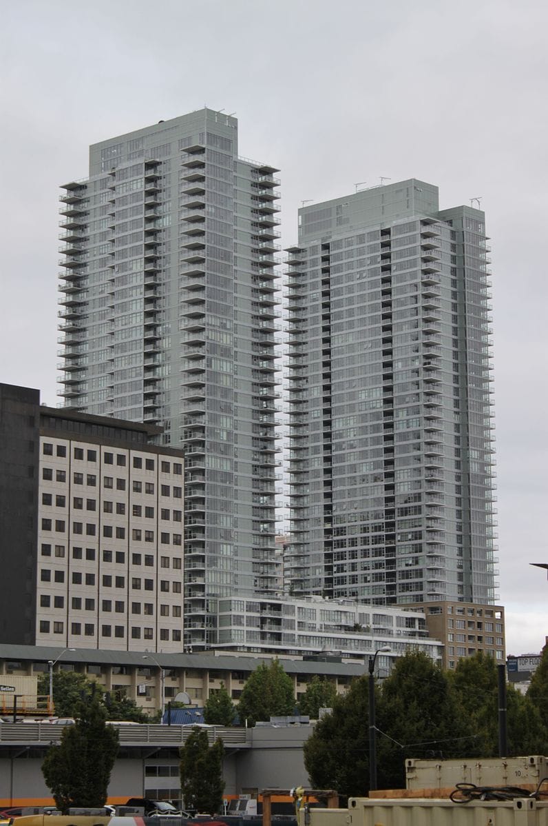
Completed in 2015, Insignia was one of the first major projects of this cycle and still one of the only condominium projects. It has 618 units split between two seemingly identical 41-story towers. It is in many ways the perfect embodiment of the extrusion building, with floors repeating. While not particularly exciting, it has an order and rhythm that makes it rather pleasing. It also has the benefit of being alone and thus very visible in its corner of the skyline, though it may soon be joined by others. It greatest claim to fame may be that it seem to be the first of Seattle’s many twin. I can count four sets under construction and three more about two start including two more sets on the adjacent block.
808 Howell
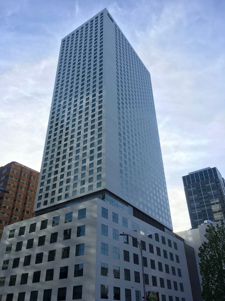
Speaking of order and rhythm, 808 Howell takes that to the extreme. The building has generated 1,264 hotel rooms and meeting space packed into 45 stories of white stone facade and floor after floor of seemingly identical windows. It is a divisive design. I personally love its relentless order, but I have heard other who think it is simplicity is overwhelming. This is also an example of where what matters is the base. At the street level the endless rectangular windows give way to an almost solid white podium with one massive multistory corner window, a very bold move, before becoming transparent at the highly open street level.
Nexus
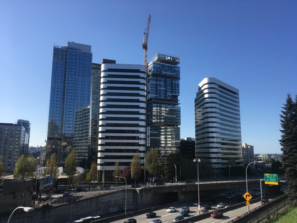
In a city obsessed with modulation, Nexus may take the prize. The nearly complete building will have 389 condominiums and 368 parking stalls in 40 floors. Highrises are often broken though form and material into smaller elements, but rarely is it done in such a dramatic fashion. The tower is split vertically into a series of cubes that each rotate 8 degrees off axis to create a series of terraces. While this is perhaps the most dramatic of the bunch, there are a number of other buildings in the pipeline that employ similar strategies.
2&U
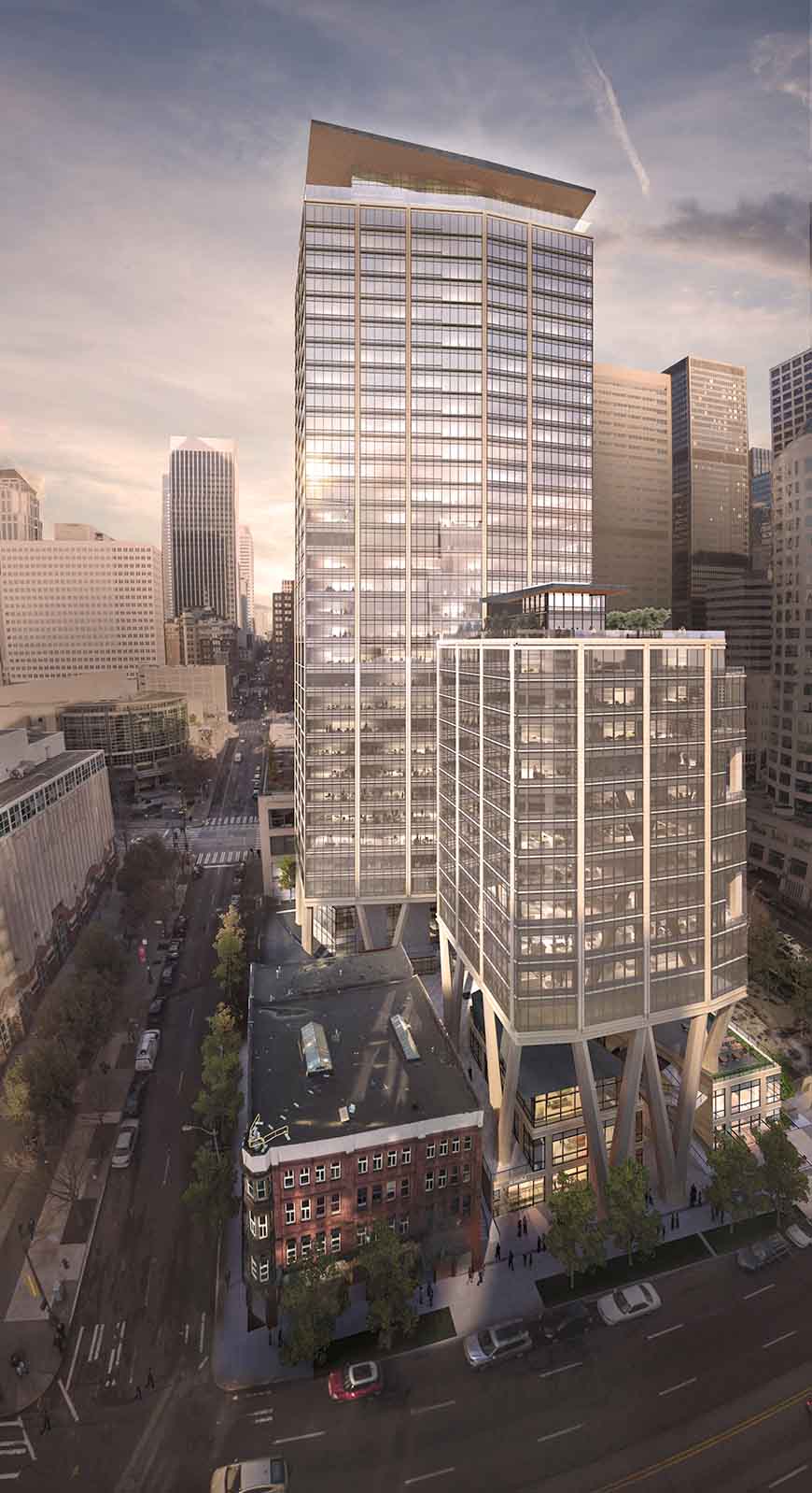
The 2&U building, recently renamed Qualtrics Tower, is a soon to be completed 38-story building with 671,000 square feet of office space, 18,500 square feet of retail, and 476 parking stalls. The developer, Skanska, hired an out-of-town architect to design what they hoped would be a unique to Seattle building and that is what they got. While the upper stories are handsome if unremarkable, the base is raised several stories above the street level to create a retail village with lots of public space designed by local stars Graham Baba, best know for Melrose Market, Chop House Row (in collaboration with Sundberg Kennedy Ly-Au Young Architects) and the Starbucks Reserve Roastery. The columns that the upper office level rest upon provide a dramatic backdrop for the retail village. Time will tell whether the retail will become a lively spec like Melrose Market, or another mostly vacant corporate plaza as seen in many of its neighbors.
Rainier Tower
Denny Centre1200 Stewart Street
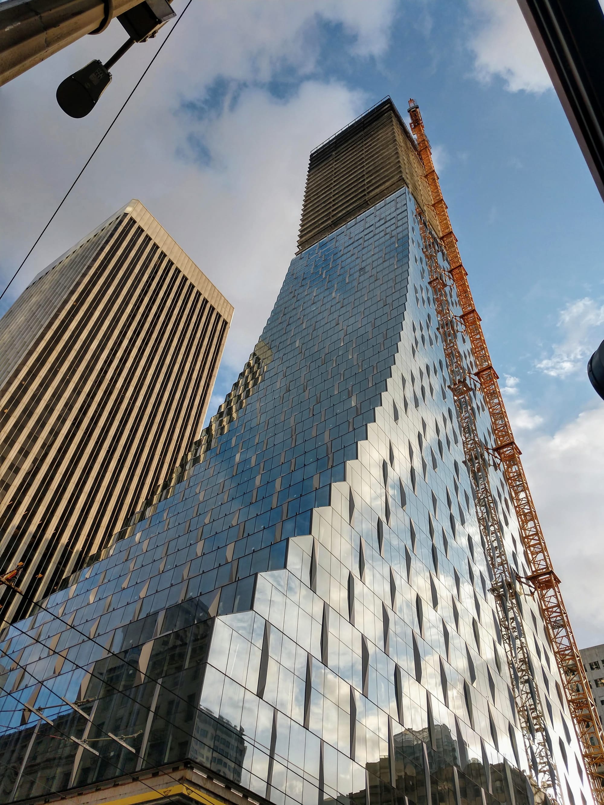
I’m grouping these two projects together, not just because they are a block apart, or because they are both project by Canadian developers, but because they represent a shift in style from what Seattle has seen in the past. Their curvy, undulating facades have a fluidity not common in our city of boxes. They are reminiscent of Aqua, Jean Gangs acclaimed Chicago highrise know for is wavy facade. Since these two projects, others have followed with proposal for building that look shaped by the wind or water. This collection of building also herald a new Denny Way. Along with the project below and several more under construction or proposed, these new buildings will transform Denny Way from the auto-oriented street known for its car wash of just a few years ago to an urban canyon home to thousands of residents.
600 Wall Street
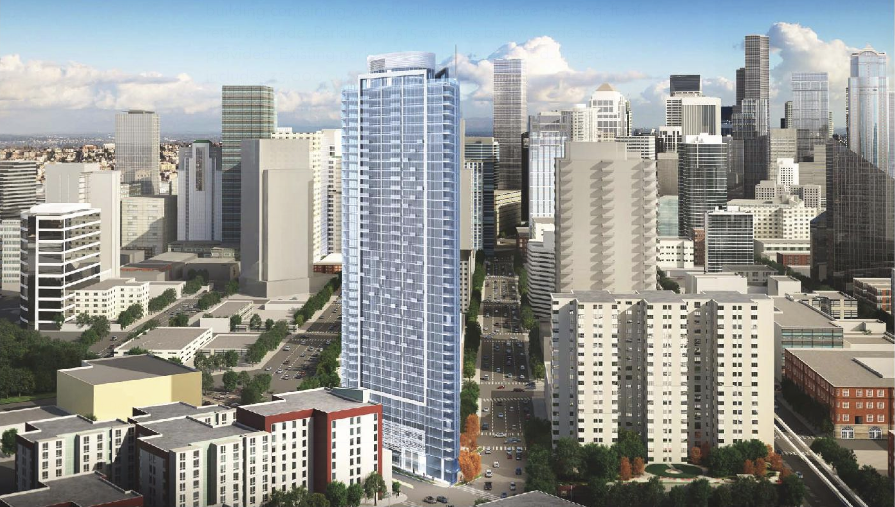
This building, which full disclosure the architecture firm I work for is responsible for, is noteworthy for the fact that it fits 43 stories, 400 condominiums, 2,000 square feet of retail, and approximately 300 parking stalls on 10,000 square feet of land–or the equivalent of two standard Seattle single family lots. The site is so small that the parking will be accessed by a car elevator. It is testament to the urban city we are becoming that a developer went to the pain of squeezing so much building in such a small space.
707 Terry (Frye Twins)
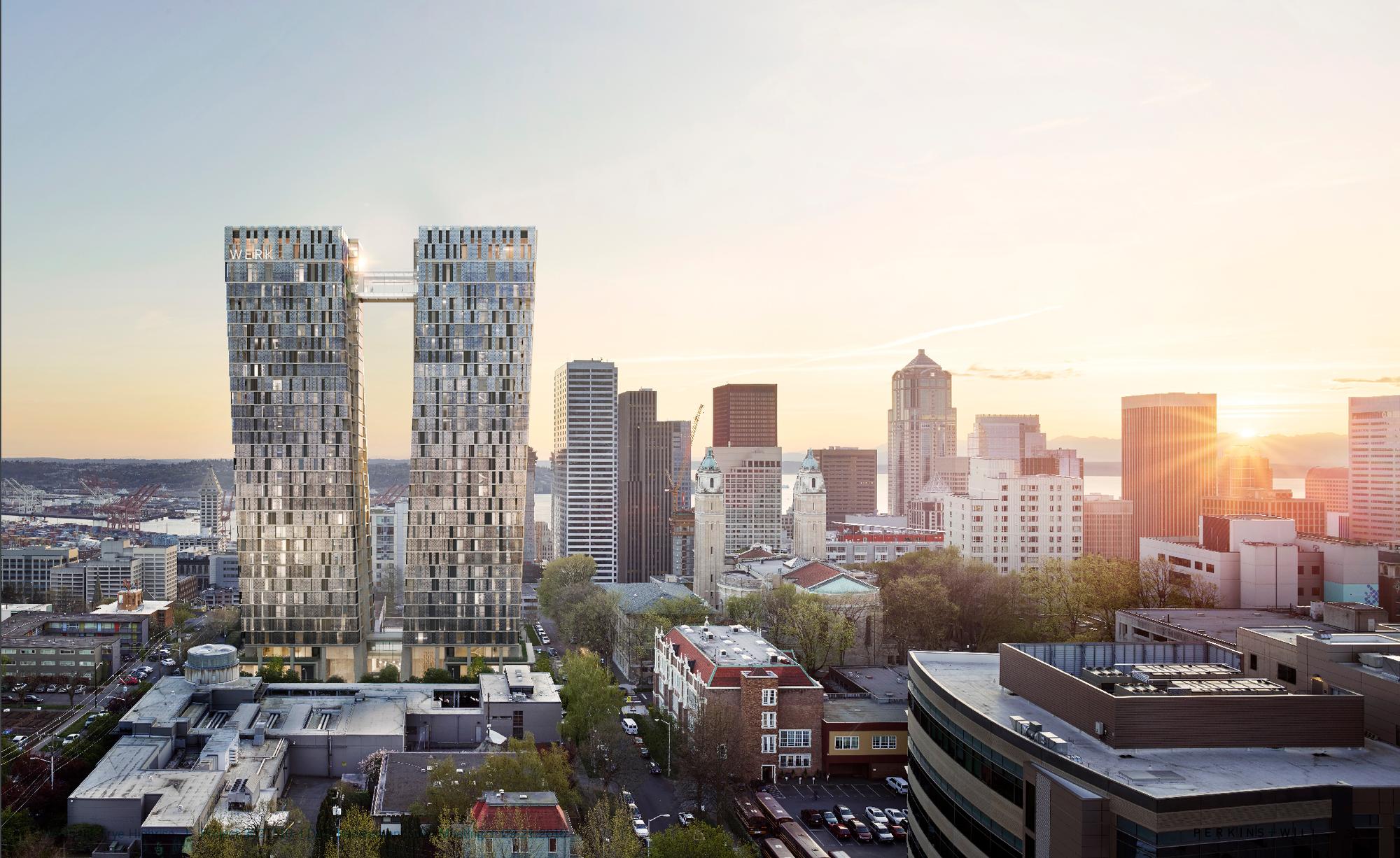
707 Terry, aka the Frye Twins is two 34-story towers rising from the former Frye Art Museum parking lot. It will have 486 units, 6,000 square feet of retail, 318 parking stalls in two 34-story towers. They are also two of the most distinctive highrises in what is a boom in new apartments on what has been relatively sleepy First Hill. I can count at least five highrises currently under construction and five complete since 2014. They, or at least their renderings, look stunning. The two towers stand in tension, each gently leaning away yet held together by a slender upper level bridge. The facade is to be composed of moveable perforated sun screens, creating a dynamic and changing image.
1931 2nd Avenue
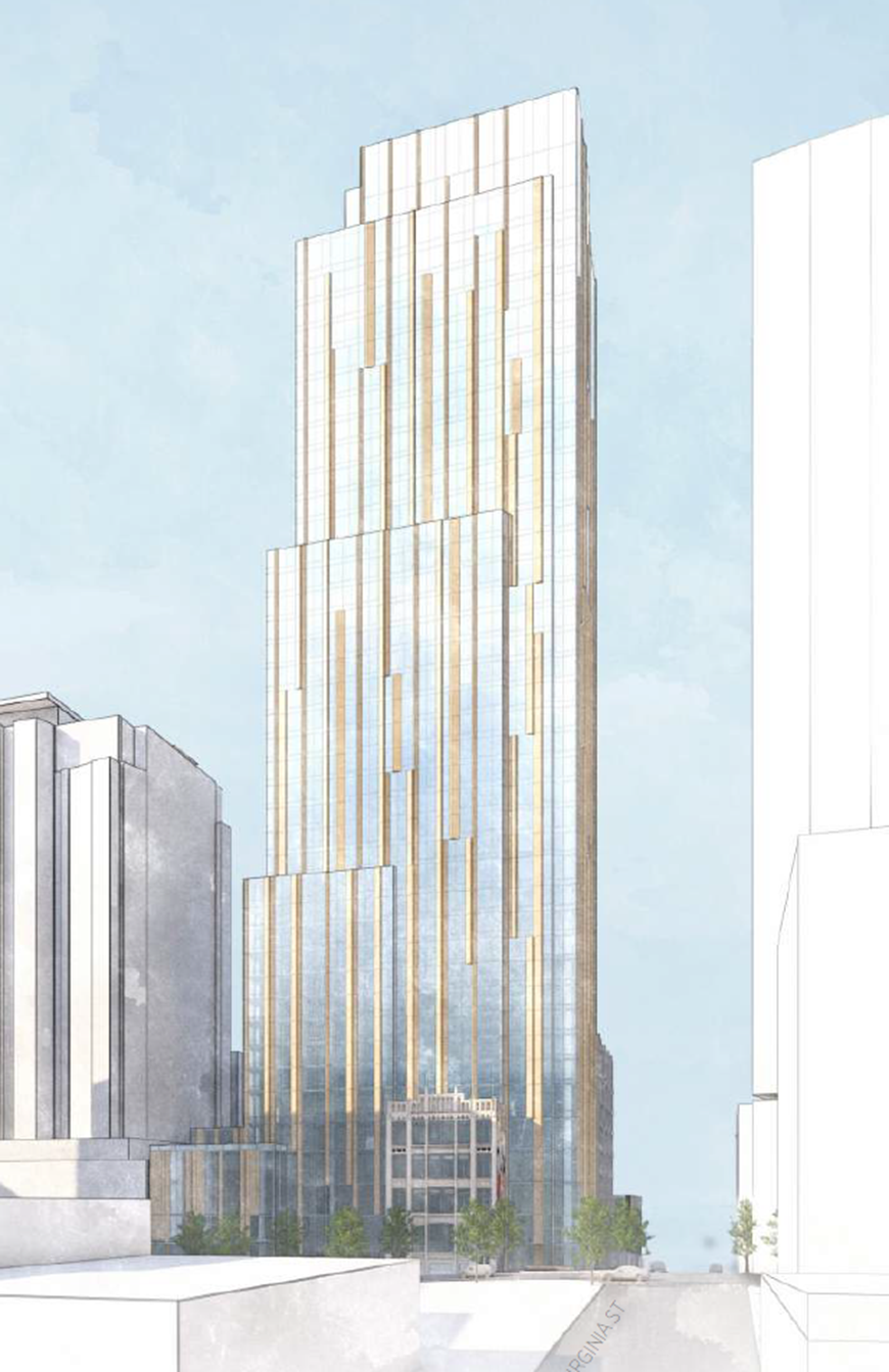
The design by noted Japanese architect Kengo Kuma may be the ultimate facadectomy. The proposal is to remove the back of an existing historic building and add 47 stories of cascading facades enclosing 200 condos, 240 hotel rooms, four levels of co-working space and 6,700 square feet of retail. In a city where outside design firms, famous or otherwise, are rarely hired, it’s refreshing to see the work of such a globally know architect be hired and to produce such a unique building.
725 Yesler
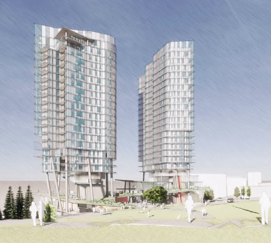
The project is 365 apartments, retail, and 248 parking stalls in two 23-story tall towers in Yesler Terrace overlooking I-5. It is notable for several reasons: its the first highrise development in the Yesler Terrace redevelopment, which while zoned for highrises has thus far produced only midrise buildings; it’s designed by Bohlin Cywinski Jackson, a nationwide firm best know for designing Bill Gate’s Medina estate and a lot of Apple stores; and it’s a pretty interesting design, better than most even. With its delicate stilts and curvy facade it strives to be more than the typical extrusion highrises being built in Seattle.
4/C
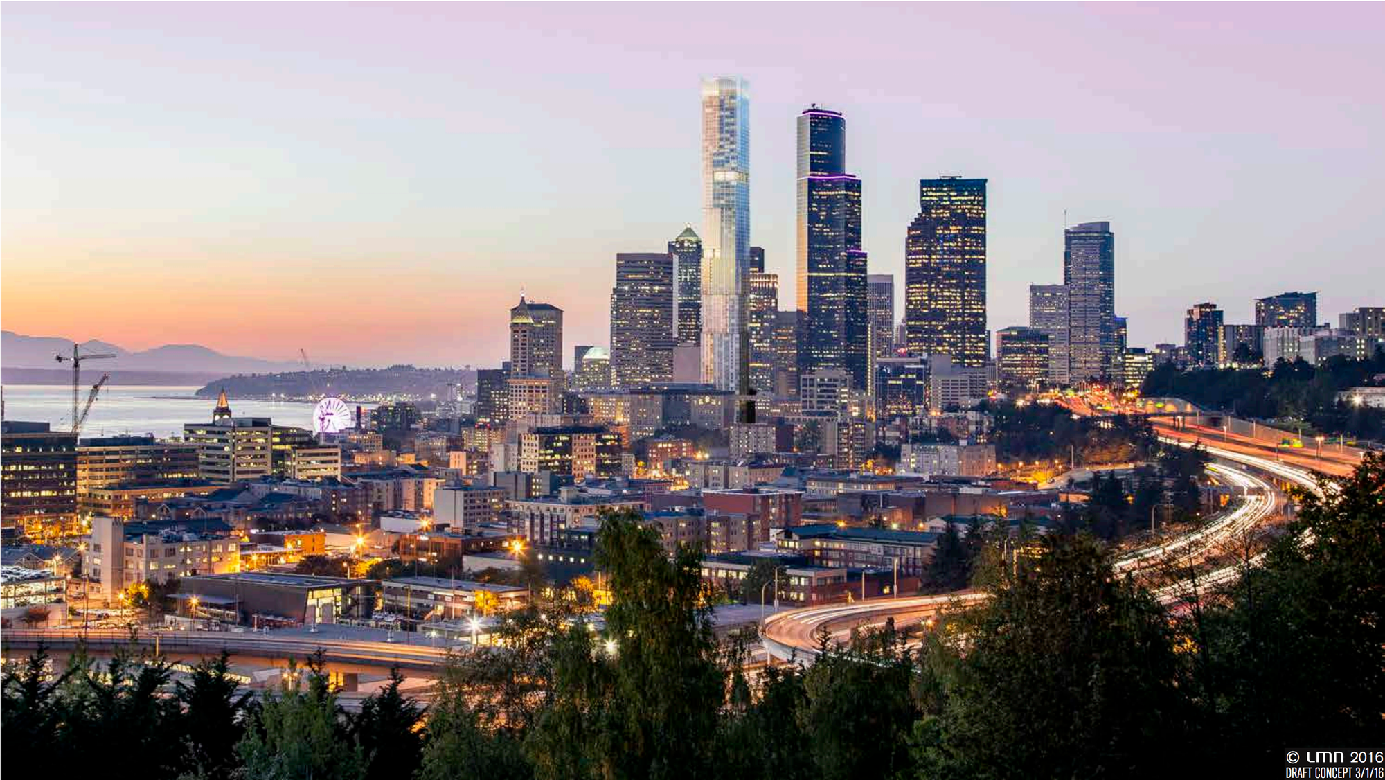
If approved and constructed, 4/C has the potential to be Seattle’s new tallest building at more than 1,000 feet. Even failing that, it may still take the title of number two. More importantly in many ways, it will bring between 800 and 1,000 new apartments to a part of downtown that gets very sleepy after 5pm. The housing plus 100 hotel rooms, 50,000 square feet of co-working space, and 30-40,000 square feet of retail would make quite the addition to downtown. It also reminds me of an old adage that the most audacious projects are usually proposed right before the crash. Perhaps Seattle will get a new tallest building, perhaps it will get a lot of talk. Either way, even if it isn’t built this cycle, it is a harbinger of things to come in Seattle’s future as property values and demand for places to live and work push buildings higher and higher.
Note: The featured image is by Bruce Englehardt via Wikipedia Commons.


