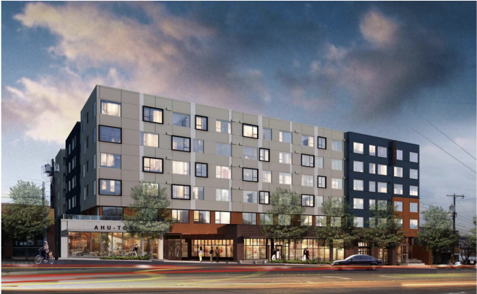
On April 10th, a building proposed in Little Saigon was approved by the Southeast Design Review Board. It will occupy a 51,402 square foot site on the block bounded by Jackson and King Streets and 10th and 12th Acenues. The site is the former Acme poultry processing complex, from which the project gets its name: Acme Farms. It will include 321 market-rate apartments (the project vested prior to the adoption of Mandatory Housing Affordability Program in the area, so no participation is required), 10,000 square feet of retail, and underground parking for 177 cars and 108 bikes. It will be one of the largest buildings in the neighborhood. It is also a bland and placeless box that unfortunately exemplifies much of the new development in our city.
Busy Buildings, Simple Buildings, and the Tyranny of Smallness
While I’m sure the architects at Tiscareno Associates are all very smart, capable people who strive to do good design, this project is a typical mediocre Seattle building: over modulated, too many material and colors, and acres of Hardie Board (literally the cheapest material money can buy). Like hotel art, it leaves you feeling nothing. I don’t blame the designers. Even with the best of intentions, between the maximum facade lengths, mandatory upper level setbacks, required floor heights, maximum roof top coverage, the design guidelines, the whims of the design review board, and the client’s budget, it is difficult to make a beautiful building. I’m a designer and face the same realities and have to wrestle with the same constraints and sometimes lose as well. It is death by a thousand cuts from well-intentioned rules promulgated to improve designs and to lead to buildings that better fit in with the existing neighborhood. The result instead is oddly shaped buildings that push and pull for what seems like no reason and look nothing like anything that existed before.
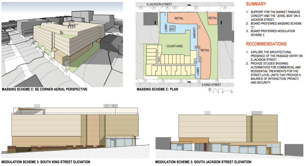
I recently listened to a discussion of Seattle architecture (Architecture Talk, Episode 2) where the host, University of Washington professor Vikran Prakach said one characteristic of Seattle architecture is a “tyranny of the small” and an imperative to break down large buildings into small pieces in hopes that no one will notice that they are in fact large. I think this may be the root of many of our problems. The unfortunate result is not small scale architecture, but big overly busy buildings with too many materials and colors.
On this one building, there are 11 different exterior siding materials. I did not count, but the number of places where the facade moves in or out must be even more. At every moment something in the facade is changing. There is not a place for the eyes to rest and take in the building. I refer to this style as one of cheap tricks: using the changes in color and material and the constant push-pull of the facade like a magician using a flash–to distract us from the poor materials and banal design.
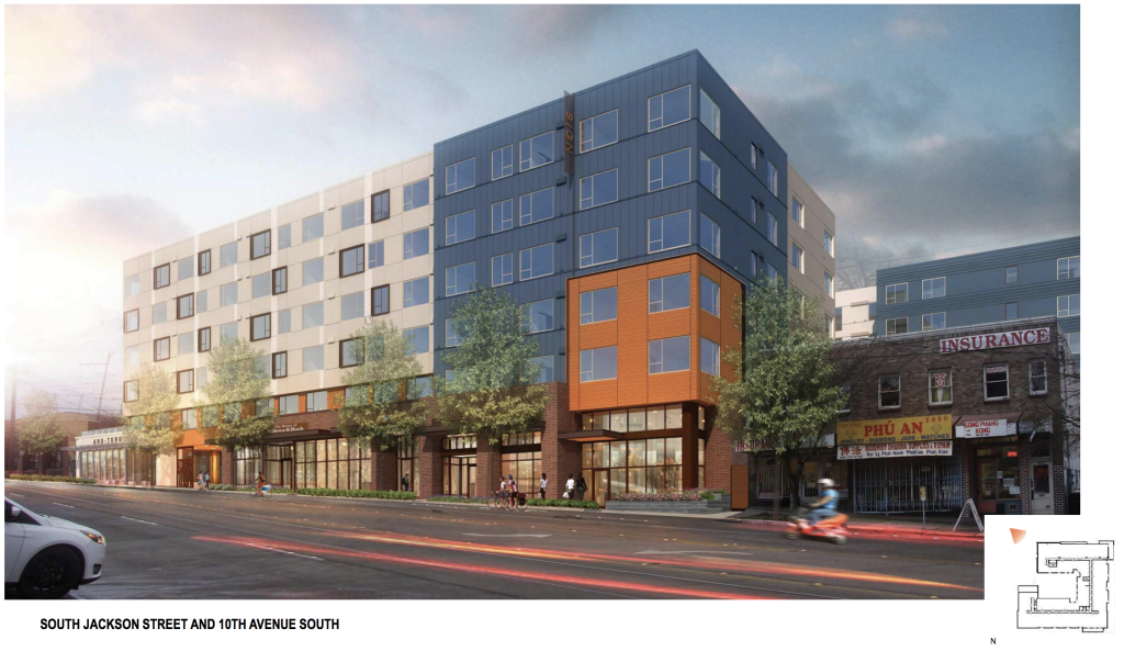
One only has to look at the historic building throughout the city to see a better way. The almost universally loved old apartment buildings of our city are essentially brick boxes that make no effort to distort their size. Their power comes from their ordered nature and their quality materials. Their facades typically have a discernible rhythm to them and a simple materials palette that include things like brick that add depth and character. Brick, and other quality materials develops a patina over time that adds to its beauty, Hardie just gets old and starts to fail. It has also become so ubiquitous as to be one of the defining characteristics of current architecture in Seattle.
In some ways, it seems that better architecture could come from lazier designers: boxier buildings with fewer, nicer materials. But under our current economic and regulatory system, it is hard to design a simple building like those we love so much from our past or from cities we enjoy visiting. And please don’t take this as a nostalgic call for traditional architecture. I love modern, minimal design and I think that the architecture of today needs to reflect the time we live in, but can learn from the qualities of what came before.
To be fair, there are realities that need to be acknowledged–land is not cheap and construction costs keep going higher, at some point vacancies will rise. Economic realities dictate material choices as much as aesthetic aspirations. This building, like most built in the city, is not full of luxury apartments and has to meet a budget in order to get built. And they make an effort–there are portions of metal siding, brick is used along much of the base, and wood elements are incorporated throughout. But in spite of the nice elements, the whole ends up wanting.
Context Cultural and Built
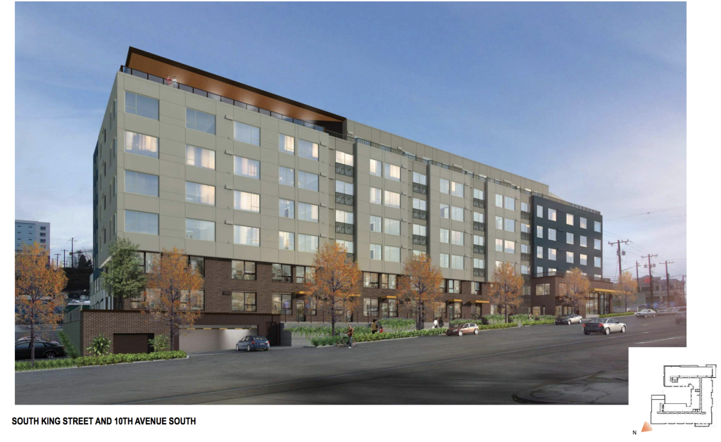
What is perhaps most frustrating about this project and the process is how much effort is expended on contextual response and neighborhood outreach and what the results are. There is an extensive section in the design review packet on elements in Vietnamese culture such as wood, greenery, and weaving and ways to incorporate them in the design. The result of this is that they use board form concrete and wood in select areas on the building, incorporate greenery, and include decorative Juliet balconies that resembles bamboo. With the exception of the balconies, all the other elements can be found in project throughout the city–in this case, they just happen to be tied to cultural context.
I am not of Vietnamese heritage and I do not live or work in Little Saigon, but what strikes me is that the community has nothing to do with the architecture. The buildings at 12th and Jackson are generic, but when the first immigrants came they were affordable and met their needs. A community is not created nor maintained by Juliet balconies but by the people, organizations, and businesses that it contains and the fabric of connections. Will the residents of Little Saigon be able to afford to live in the Acme Farm building? Will the businesses run by immigrants and their children be able to afford the retail spaces? If not, then what good does a decorative balcony do but serve as trinkets for a community being displaced?
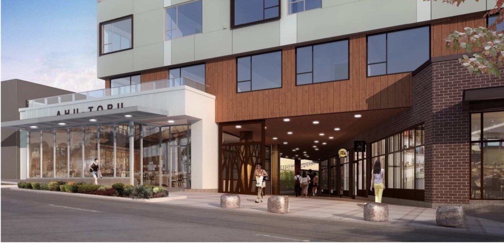
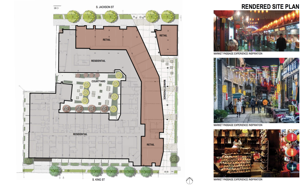
One aspect of the project that does not occur in your typical Seattle project and strikes me as a positive contextual response is a retail passage. The proposal is to create a storefront-lined passage across the site between Jackson and King Streets. From the site plan, it looks like the retail spaces are subdividable into small spaces that could be affordable to immigrants and people just starting our in business, even in a new construction building. It’s moves like this that go beyond decoration and work to make an aspect of the building accessible to neighborhood residents as well as add to the quality of the street life.
More Change is on the Way
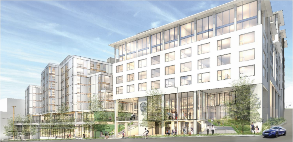
This project is not alone, but one of many new housing projects in and around Little Saigon. Directly across the street the 12th + Jackson project promises major changes to what is now an aging shopping center. And just up the hill from that is the Seattle Housing Authority’s Yesler Terrace redevelopment. Numerous other projects promise much change for what was until recently a quiet section of central Seattle, adding hundreds of new apartments. Hopefully the existing community will have a strong role in shaping what happens and will continue to call the area home for years to come.
A Crisis of Housing and Aesthetics
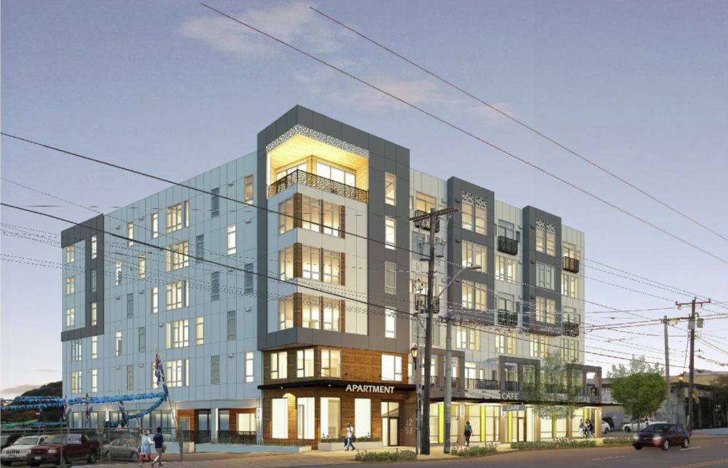
We are in a housing crisis, so perhaps now is not the time to nit-pick aesthetics, but we are also in the midst of a boom that is seeing much of our city being rebuilt in a few short years. I would hope that in the future we can look back with pride and what was built, but I fear that the opposite will be true.
I may have spent many words making that point and critiquing this building and the processes that created it, but it is also in many ways a success story. It has the survived the process to this point and hopefully in a few years the site that is now a mix of old warehouses and parking will be a place that hundreds of people will live (400-500!) and new retail spaces will enliven the streets. Several hundred people will be walking, busing, or biking to work instead of driving and living in an equivalent space to 10 single-family houses. Most importantly, it will be a place that several hundred people will call home in our growing city. I hope that we can welcome more people to our community, help those that are here now stay, and build a city that future generations can look at with pride.
Agree, disagree, or feel mixed, we would love to hear what you think. Please share your thoughts in the comments below!
First Look: City Keys Up 5% To 7% MHA For Chinatown-International District Rezone
Patrick grew up across the Puget Sound from Seattle and used to skip school to come hang out in the city. He is an designer at a small architecture firm with a strong focus on urban infill housing. He is passionate about design, housing affordability, biking, and what makes cities so magical. He works to advocate for abundant and diverse housing options and for a city that is a joy for people on bikes and foot. He and his family live in the Othello neighborhood.


