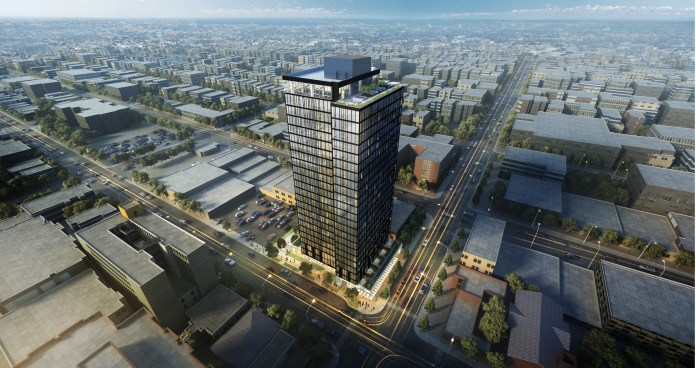
In February of last year, the Seattle City Council passed a major upzone of the University District, which allowed highrises in parts of the neighborhood for the first time since the 1970s. On April 9th, the first new highrise proposed under the upzone went before the Northeast Design Review Board (DRB) for its Recommendation meeting and won approval for its final design. The design review packet can be viewed at Seattle in Progress or Shaping Seattle.
The proposed building, called The M, will be 24 stories tall and contain 227 rental apartments over retail and 32 underground parking spaces. The site is two blocks from the future U District Link station and currently occupied by a derelict former gas station–so ideal for redevelopment.
The M will contain a mix of unit types from studios to five bedrooms as well as several two- and three-bedroom townhouse style units described as “family style.” With its location so close to the University of Washington, I would not be surprised if the larger units were occupied by students and not families. The building also has very limited car parking with just 32 stalls and additional 87 spaces for bikes. This low ratio seems in line with its location in such a transit and amenity rich neighborhood.
Early Design Guidance
Previously, The M went before the design review board for Early Design Guidance (EDG). The EDG process is designed to give feedback to the proposed building based on how the shape of the building and the arrangement of its parts are responding to the surrounding neighborhood. If a project is approved, as this one was, it will move forward to Recommendation. If not, then it has to come back for a second EDG review. Guidance is given as to what the key issues are and what needs to be focused on the most going forward. Below is a basic diagram showing how the designer–in this case NBBJ–arrived at the proposed shape of the building at EDG. Each step is showing another way in which the building is responding to its surroundings.
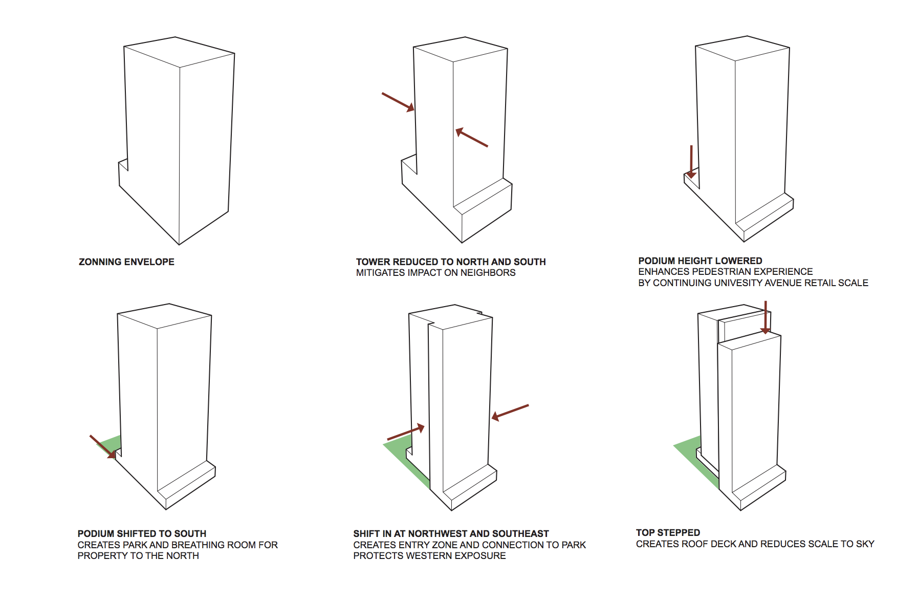
In the case of The M, the EDG feedback was to further refine the ground floor, including the proposed pocket park, to examine how to distinguish the top of the building and to add further details to the building faces, among other issues.
Street Level Response
One of the funny things about highrises is that as a person on the street, it’s really only the first couple of floors that matter, which makes them in many ways the ones that matter the most. In the case of this project, it appears as though they put a lot of thought into the ground floor by creating a wider, green street sidewalk along Brooklyn Ave NE and a pocket park that could some day serve as a through-block connection along the north side of the site.
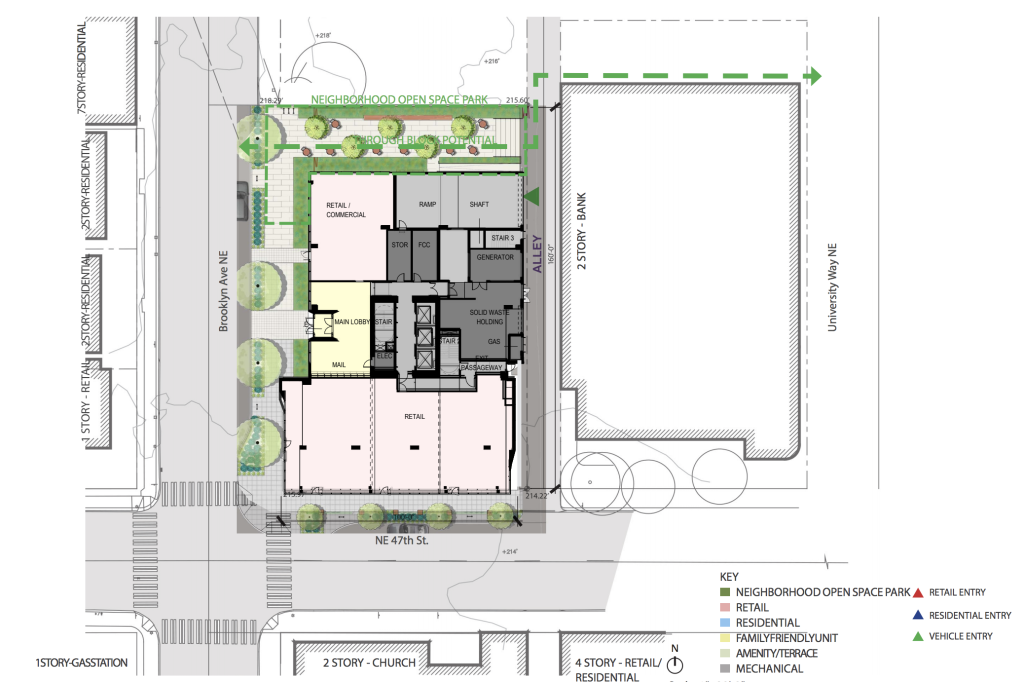
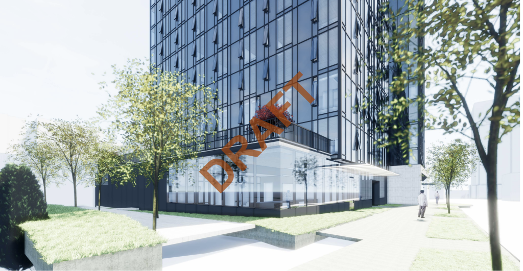
All of the street level perspectives are marked DRAFT, but along with the site plan show that effort is being made to ensure and active street front with retail and plantings. The widened sidewalk and parklet provide lots of space for hanging about as is often the case in the student-rich neighborhood and the four retail spaces provide for an engaging street. The building itself has lots of glass to connect the inside and outside of the building and awnings, which add details and provide rain protection for people walking.
Facade
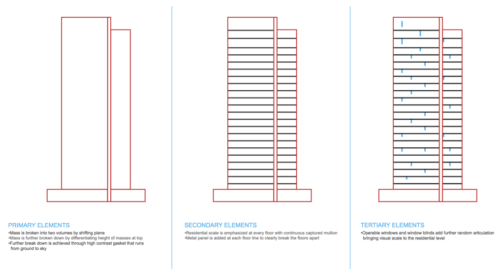
Unsurprisingly, many of the guidance items from the DRB were to work on the facades of the building—as one of the only highrises in the area, this is of extra importance as it will be very visible. This includes making sure there is a distinct base, middle, and top and that the faces of the building have multiple levels of detail. Overall, this building is what I would call an extrusion building, as in they took a shape and then extruded it to 24 stories as opposed to having the shape change as the building rises. It is a simple form that thus depends on the glass and how it is divided to do the work of making the facade interesting.
The image below shows the basic concept: break the building into parts; define the floor levels; and use window mullions, operable windows, and glass types to add a third and more subtle level of detail. It all seems so simple and unimportant, but as Mies Van Der Rohe, one of the fathers of modern architecture said, “God is in the details,” and it is often these minor elements that make or break a building.
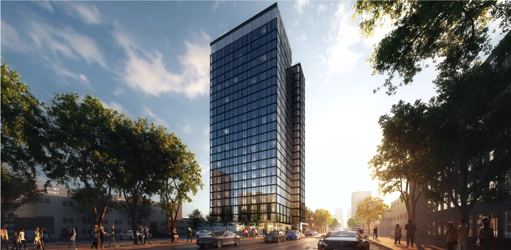
The design team at NBBJ Architects has done a wonderful job developing a facade that is simple and elegant, yet interesting and detailed. Like the before mentioned Mies works, the building takes a simple idea and sticks with it relentlessly for 24 stories.
The window pattern is continued for the length giving the building a quiet, dignified presence. It does not try to use gimmicks to obscure its size or try to distract the viewer with too many colors or materials. It also has a clearly defined base, middle, and top while keeping with its over all subtle demeanor. The base is defined by the retail level, the middle is the stacks of floors, and top is defined by the taller amenity story and the use of a more transparent type of glass that should cause the top floor to glow. That being said, lies are often rendered beautifully, so hopefully The M will look as nice in real life as it does in these images.
What is to Come
While this is the first highrise to make it this far through the review process in the University District, it won’t be the last. Already there are other proposed buildings at 11th Ave NE, Brooklyn Ave NE, as well as several site being marketed for highrise development. The core of the neighborhood is definitely in for change.
Regardless of the aesthetic or how the pocket park functions, the most important aspect of this building is that it will be a place that several hundred people will call home on a plot of land that currently houses no one. And homes that are close to transit, jobs, bars and restaurants, and theaters that make living in a city fun. In addition, due to its participation in the Mandatory Housing Affordability (MHA) program, it will either be providing on-site affordable housing or making an in lieu payment exceeding $3.5 million into the City’s affordable housing trust fund, supporting projects nearby. This project, and those that come after it, are what was hoped for with the upzone and will hopefully contribute to the life of the University District and its crucial place in our city.
Editor’s Note: This article was updated following the meeting to reflect that the project cleared design review. For more on how the design review meeting went, check out this article in The Registry.
Patrick grew up across the Puget Sound from Seattle and used to skip school to come hang out in the city. He is an designer at a small architecture firm with a strong focus on urban infill housing. He is passionate about design, housing affordability, biking, and what makes cities so magical. He works to advocate for abundant and diverse housing options and for a city that is a joy for people on bikes and foot. He and his family live in the Othello neighborhood.

