The recent Seattle Times article about conflicts on the Westlake promenade between people walking and people bicycling addressed some very real safety concerns, but missed the mark on what the problem is and who’s to blame. The conflicts between people on foot and on bicycle are definitely occurring on the promenade (commonly referred to as the Westlake Cycletrack). This is the first facility of this type that Seattle Department of Transportation (SDOT) has built, so it is not too surprising that there are some issues that need ironing out.
But rather than taking a look at why these conflicts are happening, how we can fix the promenade to prevent them and how to make sure the next facility doesn’t have the same problems, the article simply quotes some people that are unhappy with the promenade and doesn’t dig any deeper. Why are the conflicts happening? What is it in the design that allows them to occur and why were these conflicts not recognized before the design was literally cast in concrete? What’s wrong in the SDOT process that allows this to happen?

Previous Conditions
To fully understand the problems we are seeing today, we have to provide a bit of the background. Prior to this project, the Westlake cycling environment was downright miserable for all users. The narrow sidewalks were crowded. People on bicycles either had to choose to ride through the parking lot avoiding cars or ride on the sidewalk and be the cause of conflicts with people walking/running. The braver people chose the former and those who were more timid, especially families riding with kids, chose the latter. This left everyone unhappy. Motorists were annoyed with people zipping through the parking lot on bicycles, people on bicycles were annoyed with motorists backing out of parking spaces without looking and basically everyone felt that this space was not designed for them. Collisions and near misses between people on bicycles and people driving cars happened all the time.

The article discusses the conflicts that are happening between people that are walking/running and those that are bicycling along this 1.2-mile promenade. These are very real concerns and anyone who uses this facility has certainly seen scenarios where conflicts could or even do happen. But other than pointing out that eBikes can go fast and giving some quotes from a couple business owners, the article doesn’t dig any deeper to figure out why a $6.1 million promenade that was designed for years and opened a year ago is having regular conflicts between the users for which it was designed.
The problem is not any of the people using the promenade. They are acting as the designers knew they would act. The problem is the design. SDOT knew how many current users there were riding bicycles, walking, running, parking and patronizing the businesses there. They knew that if they improved the experience for people walking, running and especially bicycling, those numbers would increase significantly. They also knew that a downtown network of protected bike lanes was planned in the Bicycle Master Plan and once the Westlake bikeway connected to that, the number of bicycle users would significantly rise again.
Yet the final design for the promenade was one that was not even able to handle current bicycle traffic volumes; it definitely wouldn’t handle any significant increase in bicycling and was guaranteed to not meet the needs of the intended users. In addition it created conflicts between the different users which is what we are seeing now.
Issues with Westlake Cycletrack Design
The problems with the design include:
- Width – The bikeway width is 12’ at its widest, including around bends, but it narrows down to 10’ in one section. NACTO design guide recommends a minimum of 12’ for any two-way bikeway of any volume of traffic. With an already existing high volume of bicycle traffic that was expected to increase significantly once this project was complete, the width should have been at least 14’ to allow passing within the lane.
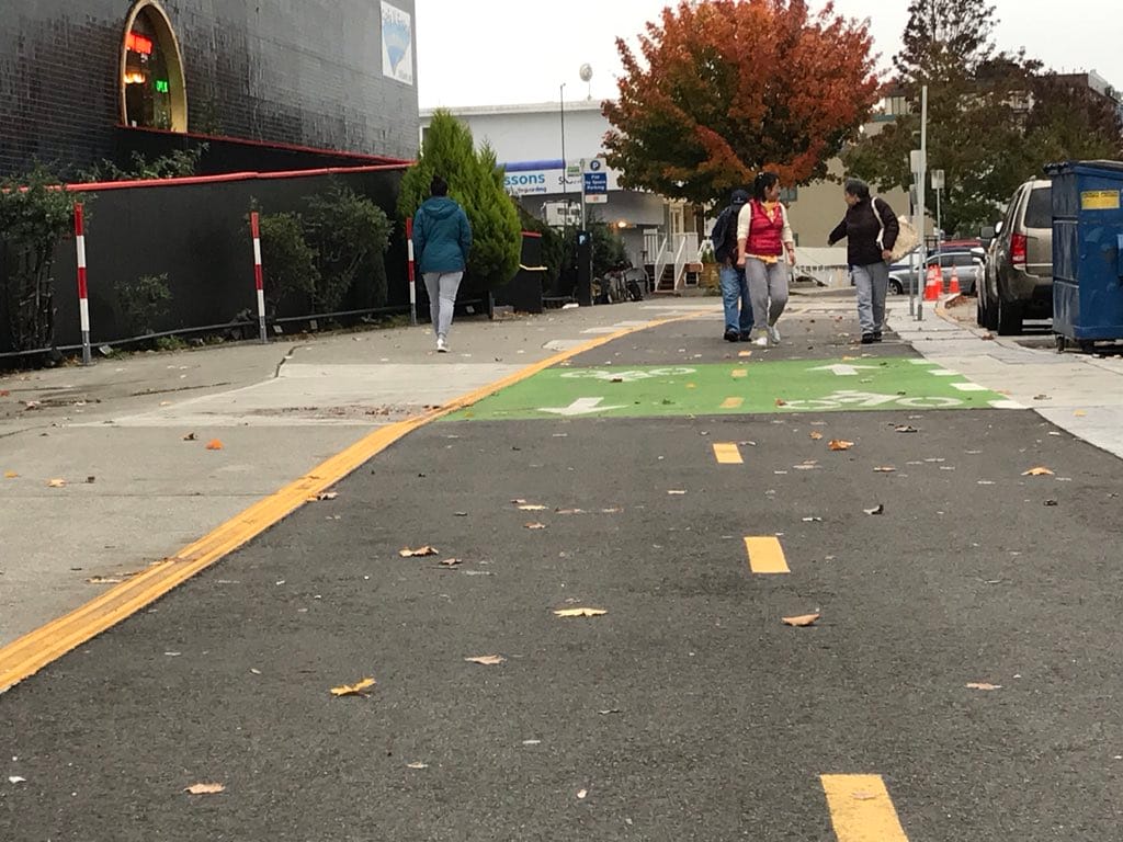
- No separation between bikeway and walkway – The walkway and the bikeway are directly adjacent to each other with no grade or physical separation to prevent users from wandering from the walkway to the bikeway or vice versa without consciously deciding to do so.
- Not enough separation with parking lot – The border between the parking lot and the bikeway is completely permeable allowing people to travel back and forth between the promenade and parking lot at any point along the 1.2-mile length of the promenade without necessarily realizing that they are crossing a bikeway when they do so.
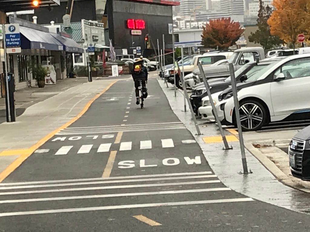
- Crosswalk confusion – There are 18 crosswalks but there is nothing that directs people on foot that they should be using these crosswalks.
- Confusing crosswalk signage – The crosswalks themselves are not significantly demarcated to make it very clear to people on bicycles that they are crossing a crosswalk or to make it clear to the people on foot that they are about to cross a bikeway. The only indication for people on bikes is the word “SLOW” painted in the bike lane as they approach a crosswalk. The only indication for people on foot is the word “LOOK “painted on either side of the crosswalk.
- Lack of signage – There is no signage or indication as to what the expected behavior is for the users. Are the people on bicycles expected to yield to people crossing the trail? The “SLOW” painted on the path suggests that they are not supposed to stop, just go slow. What about when people cross the trail at a place that is not one of the marked crossings? Do people on bicycles have to yield to them there? Much of this is covered by Washington state law, but the lack of signage and guidance makes it all much more confusing than it should be.
- No demarcation from bordering businesses – Some of the exits from businesses lack visibility of the promenade until you literally step out onto it and provide no warning or indication that you should be careful and aware that you are entering a potentially congested space with people walking, running, and bicycling.
What the Next Level of Cycletrack Design Looks Like
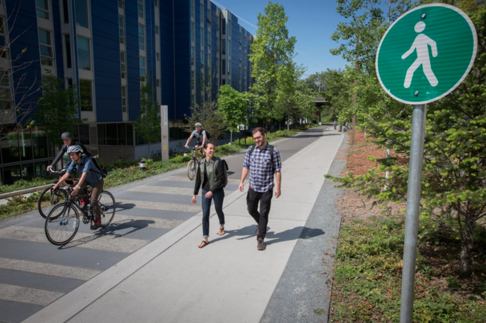
To see what the promenade could have been we just have to look at the recently rebuilt Burke-Gilman Trail through University of Washington (UW) campus which was designed around the same time as the Westlake bikeway. Clearly these two design teams were not talking to each other because the UW trail design is much better and much safer than the Westlake promenade.
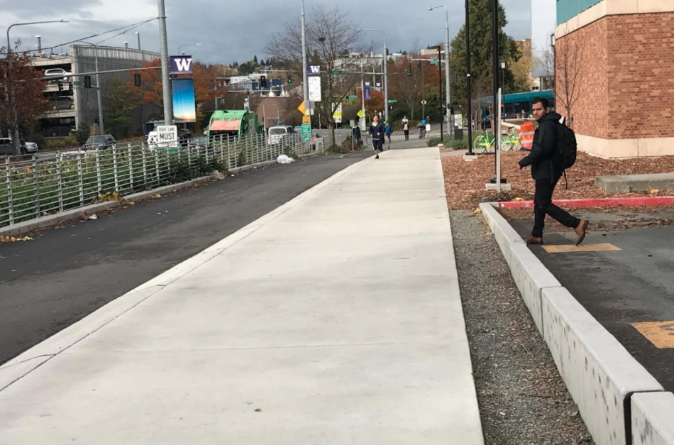
The Burke-Gilman trail has a 10’ walkway which is 3 or 4 inches higher than the adjacent 14’ two-way bikeway. The borders of the trail are also impermeable to people except at the designated crossings. People are not completely blocked from entering and exiting the trail along the entire length, but there are treatments that make it clear to people that do enter that they are crossing into a different space. As a result, people are more aware of what they are walking into.
The two pictures below show examples of this. In one there are trees planted along the side of the trail and in the other there is a low concrete wall that can be easily stepped over. These treatments make it much clearer that access is allowed but that you are moving from one type of space to another. People won’t accidentally wander across into the trail as they are looking at their phone. Similarly, if they wander from the walking trail to the bikeway, they will feel the step down and realize they are crossing the “barrier”.
Compare this to the Westlake promenade where people can walk onto the bikeway from any part of the parking lot or walkway and they are given no indication that they are stepping into a space that has potentially fast moving people on bicycles coming from both directions. We will discuss options for addressing this issue as well as other safety problems with the design of the promenade in a future post.

It’s clear that the real problem here is not the people using the trail. Any safety plan that starts with “if everyone would just…” is a failed safety plan. The Westlake promenade will be safe if everyone will just always be conscious and aware of where they are and where the other promenade users are at all times. Everyone will never “just do something” no matter what it is. The problem is the design. Mike Lindblom, the author of the Seattle Times article, should be pointing his finger back at SDOT and the Mayor’s office for spending $6.1 million to build a facility with a faulty design that they knew was going to result in conflicts like this.

Getting It Right the First Time
Subsequently the Seattle Department of Transformation (SDOTr) will be presenting some proposals to fix the design of the promenade. Also, we’ll analyze how it is that we ended up in this situation so we can make sure we don’t waste another six million dollars making similar mistakes on the next facility.
Unfortunately, the design that SDOT used for the Westlake promenade can’t see profound changes without ripping it up and rebuilding. This is why it’s important for SDOT to not compromise on safety like this and for the Mayor’s office to give SDOT the political backing the department needs to be able to do it. Mistakes like this are cast in concrete for at least 10 years, and in most cases more like 15 or 20 years.
Seattle Department of TRANSFORMation (note capitalization) is a volunteer group of local transportation engineering, urban planning and safety advocacy professionals who work for/with Seattle DOT in various official and unofficial ways. We advocate for safety, equity and sustainable policies in transportation. We remain anonymous so we can speak the truth. Not associated with the City of Seattle or Seattle DOT. We are morally opposed to pineapple on pizza. @SeattleDOTr


