I-5 is known for its colorful overpass columns in certain parts of Seattle, but the First Hill Improvement Association (FHIA) wants to bring a little more color close to home. Overpass columns will be painted with some unique designs between Cherry Street and James Street. FHIA has sought the expertise of Urban Artworks to help with design options and putting them into action. Urban Artworks has come up with a variety of concepts, which include:
- “Seasons” by Angelina Villalobos;
- Wildflower designs by Baso Fibonacci;
- “The Taste of Cherries” by Forrest Perrine;
- “Sunlight Over First Hill” by Nathan Watkins; and
- Checker-like black and white designs by Rose Alyea and Gabriel Stromberg.
Angelina Villalobos
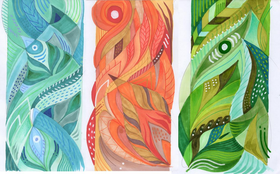
According to Villalobos, her concept come from the perspective that a year in Seattle can be represented in many ways and seasons:
In Seattle, new buildings are raised, our beloved salmon have their run, and festivals are celebrated in parks. However, the vitality and brilliance of the city is most notable in the change of seasons. Seattle is a city where we may most clearly observe this in the color of our trees and native plants. We are the audience to the cycle of growth and our environment may influences even the simplest change to our personal lives.
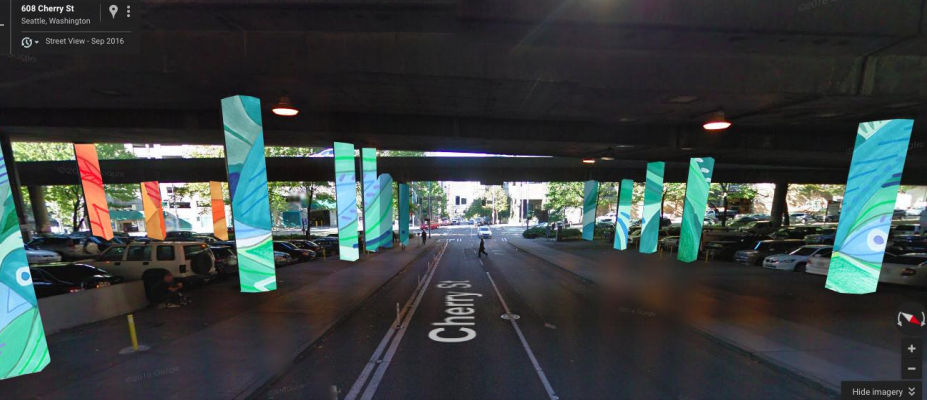
For the First Hill Underpass, I envision engaging the path of commuters alike through the pillars in a metaphorical passage of time.
The design I propose would call for climbing vines to wrap around each pillar. Starting where the sun rises in the East at 7th Avenue and finishing where the sun sets in Elliott Bay. The vines will transition into waves following the natural path to the waterfront. I’ve organized each pillar into 3 pairs. Each pair is then assigned a season differentiated by color. Spring and Summer are combined as one and will showcase variations of greens. Autumn is represented by flashing oranges and reds. Winter invokes the cold with turquoise and teals. Each season finally transitions into blue and purple waves accented by the seasonal color.
Baso Fibonacci
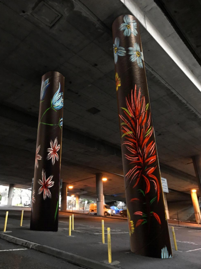
Fibonacci’s concept imparts the beauty of Pacific Northwest wildflower:
The idea for this proposal is to paint Northwest wildflowers on the pillars. I like the idea of bringing colorful nature into the dark grey area and referencing people bring flowers to those in the hospitals. I represented eight different local wildflowers throughout the full color spectrum. These could be placed in different variations across the pillars.
Forrest Perrine
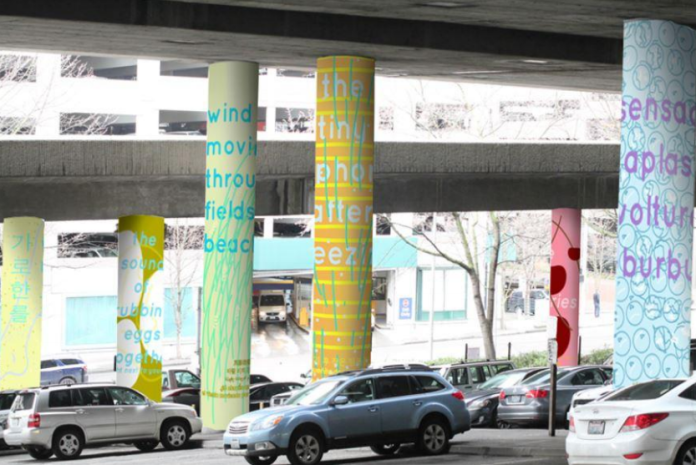
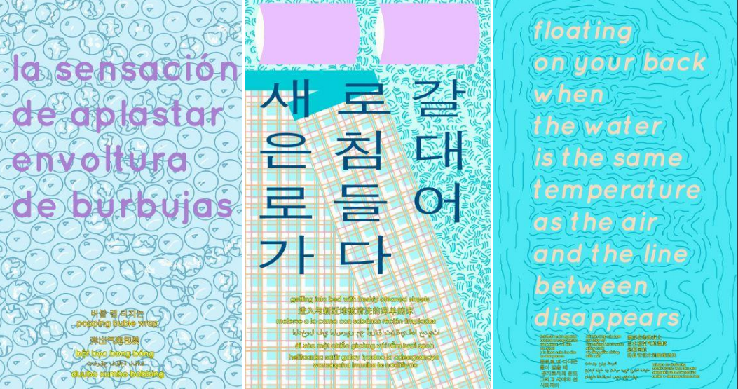
Perrine proposes to create columns of phrases to draw out positive feelings from overlooked things that make people feel good:
My piece is based on the darkness of the underpass and how it relates to this particular moment historically as well as personally. For the past few years, suffering has overtaken the loved ones around me–depression, cancer, self-harm, bipolar onset, etc. When one friend starts to break free, another gets sucked in. But I know these are not isolated incidents–this is a moment people are struggling with and has sent many of us into some deep, bottomless pits. Underpasses can often be a visual embodiment of the despair that’s running wild these days–dark, dirty, uneasy and covered with the potential to be crushed by the running weight above you.
The piece I am proposing seeks to redirect these feelings into tangible affirmations. Its name is taken from the 1997 Abbas Kiarostami film Taste of Cherry about a man looking for someone to bury him after he ostensibly takes his own life. The last person he picks up tries to talk him out of it, telling him that if he does he would be giving up the taste of cherries. My proposal is to cover the pillars of the underpass with phrases like that of the film (in multiple languages), intended to elicit a feeling-memory that reminds us of some of the pleasures found and overlooked in everyday existence. In addition, the pillars will each be unique so they also serve as place markers for people trying to find their way in the underpass. Some examples includes:
-The feeling of a dog licking your face
-The smell of a swimming pool
-Butter sinking into toasted bread
-The weightlessness of jumping in an elevator
From murals to installations to my current curatorial project Outer Space, public space has been integral to my art practice and remains so both aesthetically and politically. Lending some love to that underpass would be one of the most thrilling honors I can imagine.
Nathan Watkins
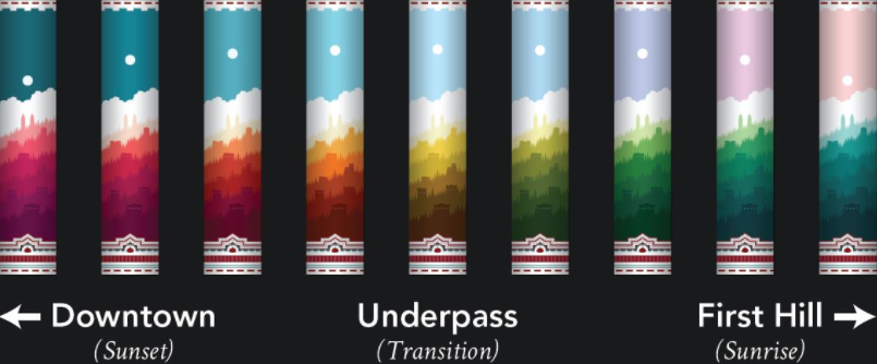
Watkins wants to explore the perspective of sunlight over First Hill with variations on color to portray the changes that light has on the urban landscape:
When I was asked to envision a gateway into First Hill, one immediate question arose: how does one visually capture that which makes First Hill so different from every other neighborhood? Having already put in so much thought into distilling the essence of First Hill in my research for designing its signal boxes, I was able to begin answering this question with a strong foothold. After many days of thought, I decided the most effective way to signal entry into First Hill to the largest amount of people would be to build from its common visual cues, amalgamating elements taken from places like the Italianate style brick architecture common in First Hill, the steepness of the streets, identifiable landmarks, a larger than average amount of greenery, and geographical bearings.
After deciding on a concept, I was then posed with the issue that beautifying these pillars presents: the images could not be distracting, but at the same time they must be eye-catching and beautiful. To address this paradox, I established that the pillar images must contain two coexisting experiences in one: to the drivers, they must be non-focal images, lacking detail or complexity but still creating a beautiful, pleasant, and welcoming visual atmosphere. To the pedestrians, however, they must allow for extended focus and visual exploration, necessitating a higher level of detail and complexity.
After moving through countless sketches, I realized the solution to this problem was to design the images in a way in which the larger “coarse” details overpowered the smaller “fine” details, almost as if designing the composition in reverse. With this design, a driver passing these pillars will see an impression of the subject, but from a farther distance and a greater speed the color becomes the focal point and the actual subject matter becomes subdued. A pedestrian, on the other hand, will be nearer and move slow enough to see the detail of the subject matter, which at that distance will demand attention over the overarching swaths of color. Overall, this creates the effect of being eye-catching without actually needing to catch the eye.
In being so identifiably “First Hill”, the finished product of this design would in effect claim the underpass as explicit First Hill territory by absorbing the buffer zone between the neighborhood and downtown with a true product of its own culture. This design could represent no other area, and in being as such it is a powerful expression of the identity, character, and presence of First Hill.
Rose Alyea and Gabriel Stromberg
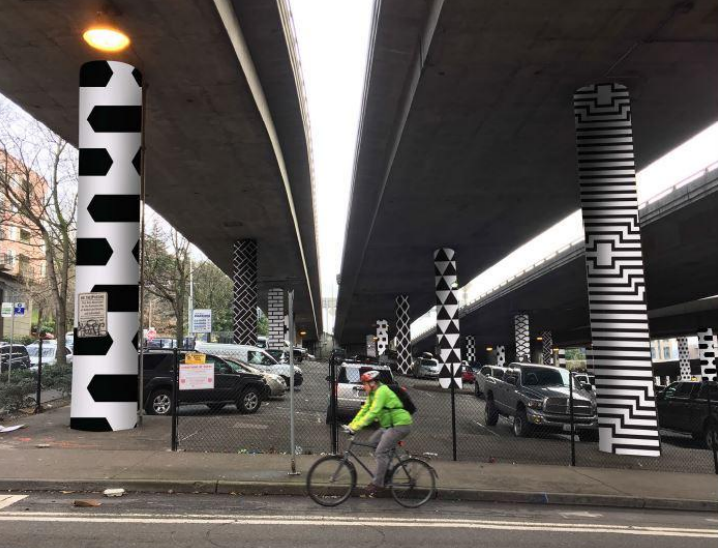
Alyea and Stromberg are proposing somewhat simplistic checker-like patterns in black and white, but they add a playful and bold touch making the dull columns pop:
The experience of the specific location informed our design approach. The columns have a massive presence and, when walking between them, one is in the shadow of the overpass and highway. Our aim in implementing a bold and graphic visual aesthetic is to infuse the space with energy, vibrancy, and prominence.
Because the site is visible from myriad viewpoints at varying distances from both First Hill and Downtown neighborhoods, developing a design that maintains visual impact within a wide range of perspectives was of crucial importance. Our ultimate goal is to establish this space as a distinct landmark that informs and elevates the existing urban landscape.
In addition to the artwork, we would like to create a small digital site that could act as a key for the abstract patterns. We would highlight the concept of each pattern and give a brief description detailing how it connects to Seattle. The design would be specifically targeted to viewing on the phone so it can be easily accessed while walking through the cityscape. We would also plan to include a sign onsite that calls out a specific hashtag for tagging in social media posts.
FHIA is soliciting online feedback on which of the five design proposals should move forward with the paint treatment. Voting closes tomorrow (Tuesday, March 8th) and installation should begin in May.
First Hill Improvement Association – I-5 Column Proposals by The Urbanist on Scribd
Stephen is a professional urban planner in Puget Sound with a passion for sustainable, livable, and diverse cities. He is especially interested in how policies, regulations, and programs can promote positive outcomes for communities. With stints in great cities like Bellingham and Cork, Stephen currently lives in Seattle. He primarily covers land use and transportation issues and has been with The Urbanist since 2014.


