Here at The Urbanist we thoroughly enjoyed the Seattle Design Festival, which stretched from September 10th to the 23rd. We highlighted women currently working in Seattle to design our urban fabric in a series these past few weeks called Women Shaping Seattle.
We thought we would close our design fest coverage by asking The Urbanist writers to highlight some of their favorite instances of good design in Seattle, and what they think makes that design great.
Chophouse Row
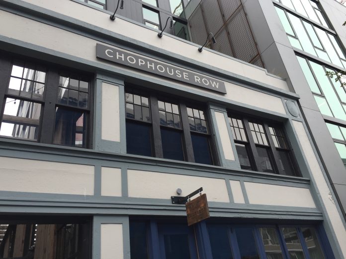
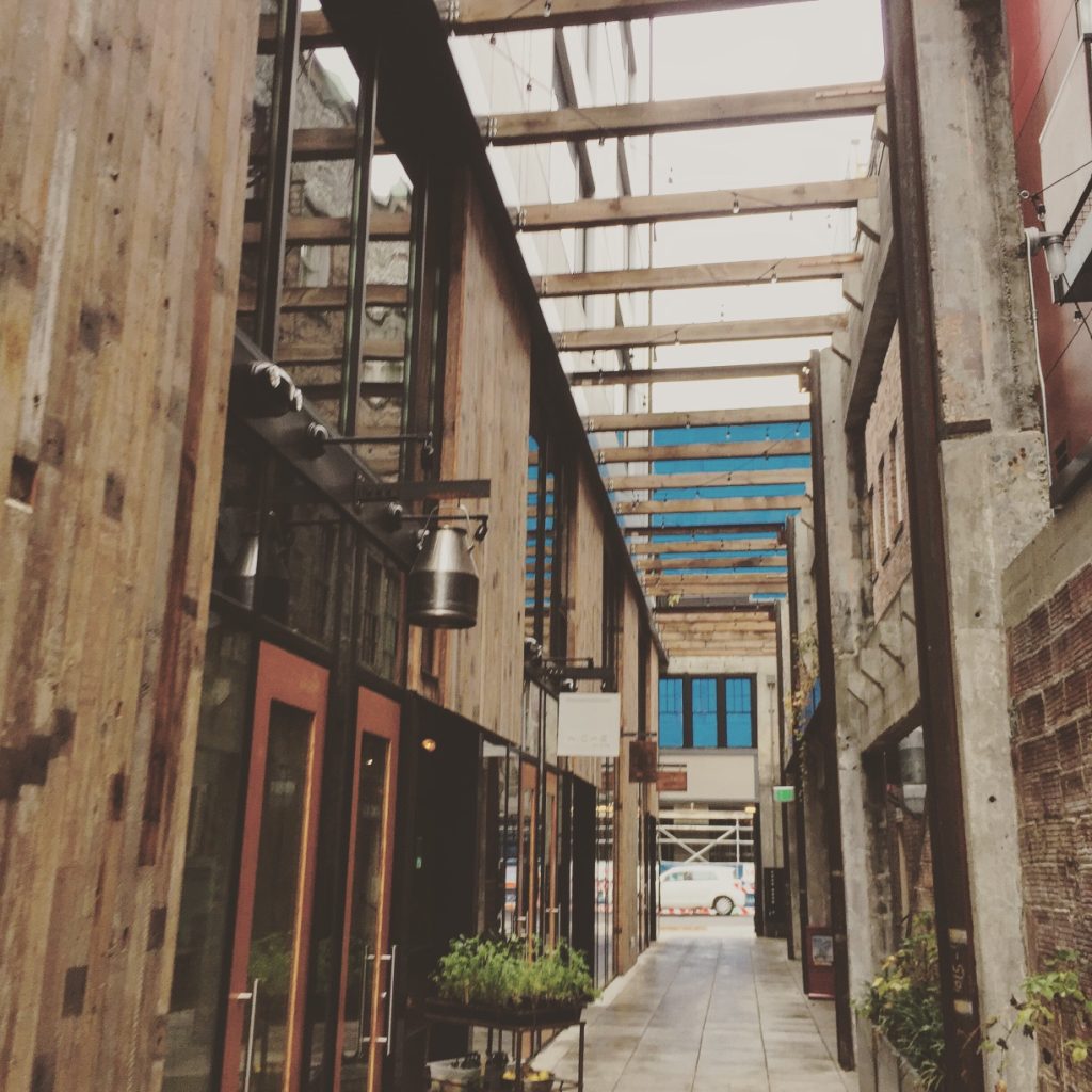
Chophouse Row is a great addition to Capitol Hill because how strongly it activates the street and luxuriates attention on pedestrians. Providing a mid-block pedestrian throughway, who would think in this age of alley vacations! It doesn’t hurt that the building itself is gorgeous with steel beams and exposed rich-grained wood and weathered brick.
The two-story storefront gently transitions to the taller modern apartment building overhead and to the right as well as to the historic brick building to the left. The end result is a graceful architectural transition from historic to modern all while providing pedestrian permeability and high quality vendors within. Oh and the food is delicious to boot. The ultimate test of the pedestrian experience: Is the building worth walking by? Does it grab your interest? We are all window shoppers at heart. Chophouse Row is worth walking by. Heck, go inside!
–Doug Trumm
Alley 24
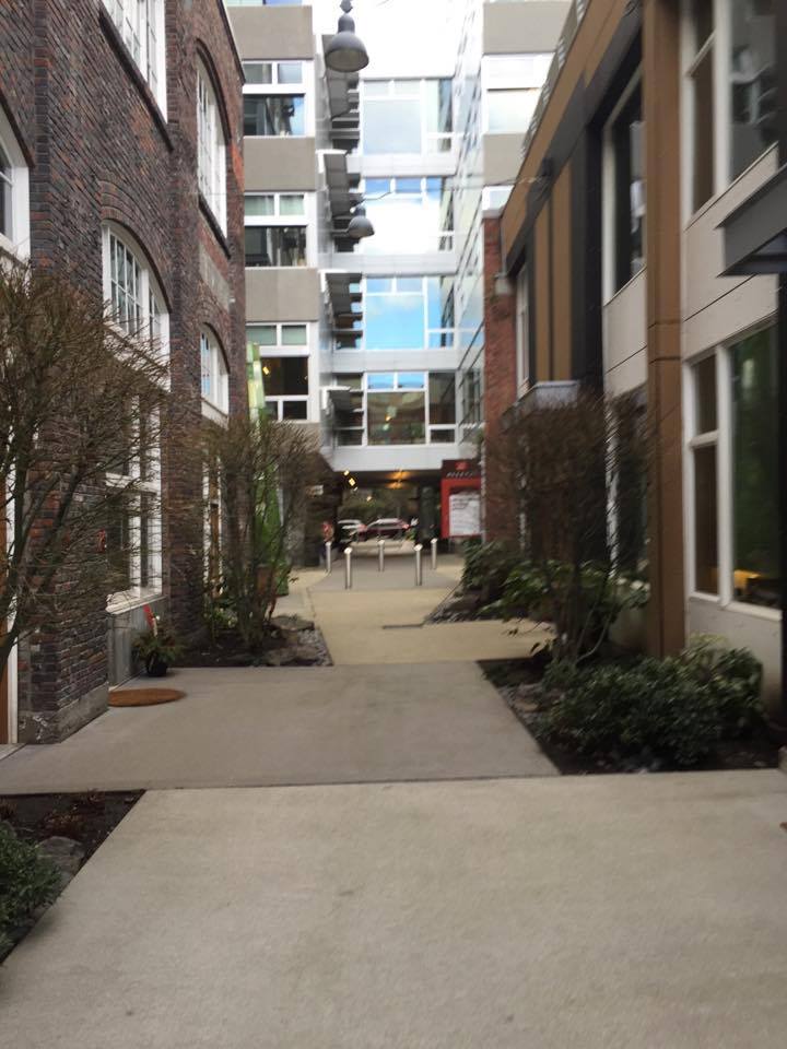
Situated in the Cascade corner of South Lake Union is an unassuming multi-layered development. Aptly named Alley24, the redeveloped complex consumes one city full block, blending former industrial warehouse buildings together with bold, modern construction. The design imparts an authentic feel by retaining quality heritage brick structures in full while partially capped at each end with very distinct contemporary structures.
On the opposing side of the alley from the warehouse-turned-residential walkups is another contemporary addition, further distinguishing itself from the other parts of the complex. The developers wisely took advantage of the former north-south alleyway, retaining it for limited rear access and inviting pedestrians to use it as a pass-through—what you might call a woonerf. A cross-passage was also added connecting both sides of the complex for east-west access on foot. But the elaborate site design doesn’t end there. The ground floor residential warehouse units were carefully restored with thoughtful semi-private gardens and overhead weather protection.
Attention was placed on landscaping the edges of the development with environmental design. And, semi-public space is interspersed throughout the site.
–Stephen Fesler
Columbia Park
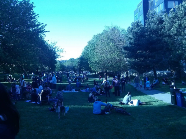
The in-between green space of new and old Columbia City. Littered with families, library books, good food, and energetic children every Wednesday at the farmer’s market.
–Leila Willoughbey-Oakes
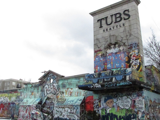
TUBS public art space
I was only able to enjoy the twilight years of TUBS. From 2009 to 2014 the U District hosted a daily living, breathing, 24/7 art exhibit at the corner of Roosevelt Way NE & NE 50th St. The bathhouse turned street art canvass was a mish-mash of creativity, “crassness” and chaos. Visiting the 2016 Seattle Design Festival Block Party this past weekend, I was reminded that there are not nearly enough public art spaces in Seattle. The TUBS art space was unique, unstructured, uncurated, unofficial, unprofessional, and raw. It was inspiring to participate as a spectator, and a one-time contributor.
-Laura Bernstein
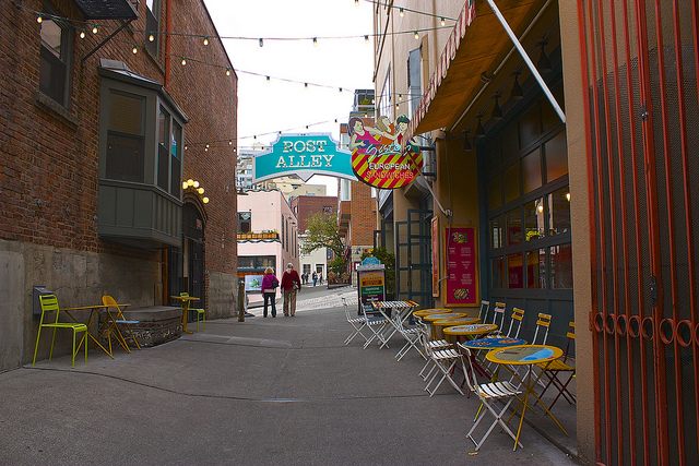
Post Alley
Notice an alley theme and pedestrian cut-through theme?
Pike Place Market is somewhat of an accidental built environment. It certainly wasn’t designed by one person with its current usage in mind, but is instead a hodgepodge of buildings that now seems really cohesive in retrospect, thanks to the preservation of the Market as a whole.
Post Alley is really the best part of Pike Place. Not too crowded, for the most part, unlike the Main Arcade, and a full pedestrian thoroughfare from Belltown to Pioneer Square, with a few blocks where you’re on your own. Along what other pedestrian pathway can you go from a full brewpub to a French bistro to an English pub to a medical clinic?
In this instance, great design is really just leaving something where it is, and playing to its strengths. It’s not starting from the ground-up but letting the urban framework play its song.
–Ryan Packer
Ryan Packer has been writing for The Urbanist since 2015, and currently reports full-time as Contributing Editor. Their beats are transportation, land use, public space, traffic safety, and obscure community meetings. Packer has also reported for other regional outlets including Capitol Hill Seattle, BikePortland, Seattle Met, and PubliCola. They live in the Capitol Hill neighborhood of Seattle.


