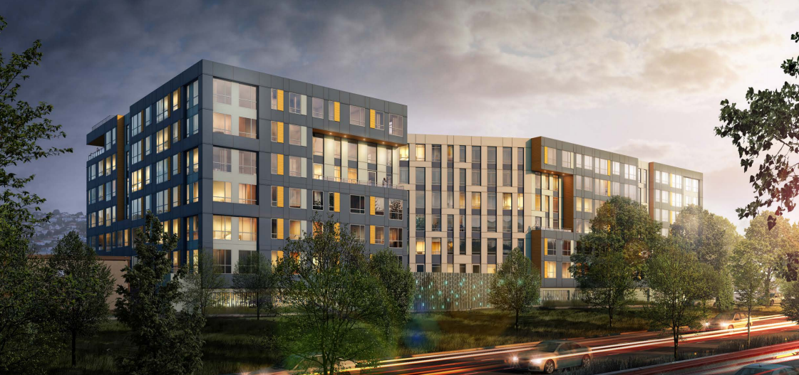
Another large scale residential project is in the works for Interbay, this time led by national builder Lennar. The “Dravus“, as it’s known, could deliver approximately 226 residential units to the neighborhood. Lennar has tapped a local team of designers from Encore Architects and Communita Atelier PS to polish building plans. The project is notably larger than its recently-approved neighbor, The Crane @ Interbay, a 38-unit building just a half-block to the south.
Lennar is probably best known for their single-family developments nationally, but their multi-family arm has quickly entered the local market with a suite of large scale projects, including the Atlas Apartments (Issaquah), 2020 Madison Apartments (Capitol Hill), and The Whittaker (West Seattle). Sticking with the Seattle market, Lennar began permitting work on the Dravus in early 2015 with hopes of constructing a building that could total 251,395 square feet.
The new apartment building will have a full range of unit types, including: 10 townhouse units, 19 two-bedroom units, 86 one-bedroom units, and 111 studios. Supporting these, Lennar plans to provide 13,322 square feet of amenity space, 90 bicycle parking spaces, and 156 vehicle parking spaces. The parking ratio breaks down to 0.4 bicycle spaces and 0.7 vehicle spaces per unit. And while it’s not clear yet, affordable housing (see SMC 23.58A.014) will be provided by the development to achieve the overall density and building height. If that weren’t enough, Lennar is targeting high environmental standards for the building with LEED Gold Certification.
Context and Assemblage
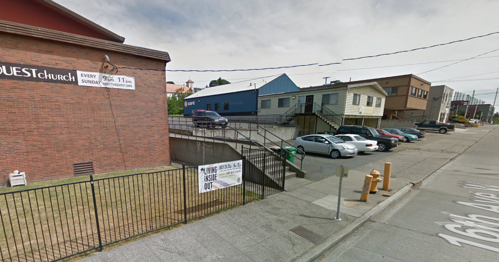
The Dravus sits in the middle of a long north-south block in the heart of urban Interbay. Flanked by busy 15th Ave W to the east, it’s hemmed in by a tow-truck yard to the north and Seattle Film Institute building to the south. Across the street on 16th Ave W is QFC, a local grocer, which no doubt will be a welcome amenity to future residents.
The site is comprised of three properties, which include a warehouse and church campus. All of the existing buildings will be removed in order to redevelop the site. Taken as a whole, the site is just shy of an acre at 36,000 square feet, which would suggest an impressive net density of 273 units per acre.
Project Evolution
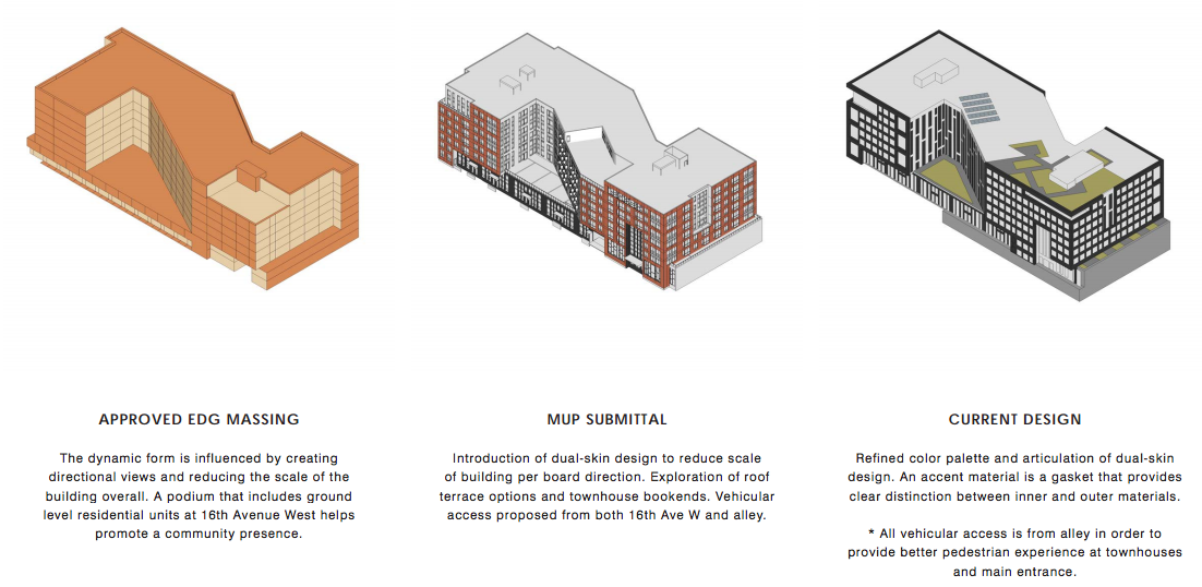
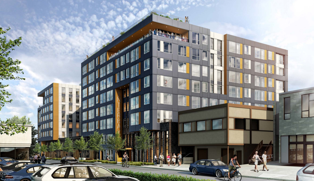
The project has been significantly refined through the design review process, as represented above. Though the basic “Z” shape of the building has survived into the final product, detailed massing, materials and color pallette, and site amenities have been improved upon, leaving a very polished and modern design. On the whole, the project proposal was well received by the design review board; they gave their blessing for approval in early November.
Earlier this month, I had the chance to ask Bryan Bellissimo, Encore’s lead designer on the project, about the Dravus’ overall design approach. Bellissimo explained it in this way:
[T]he building has a unique presence in the city where it presents two primary facade exposures. [W]e wanted to design the massing in a way that allowed both exposures to command a dynamic presence. The overall form of the structure takes on a “Z” shape in plan. By doing this, we can create two triangular shaped courtyards that face both 16th Ave W and 15th Ave W. The diagonal nature of this move brings something new to the neighborhood and helps to create juxtaposition from the rectangular boxes that we see so often.
Inspired by the ways technology can inform the artistic process, the exterior facades of the building are “coded” in the way that the fenestration is derived. The “outer” skin of the building is a system of punched windows that form a rigid grid like appearance. This is differentiated by the triangular courtyard facades (“inner skin”), where vertical ribbon style windows are used. This dynamic play of facade languages allows the overall mass to be broken down while also reinforcing the concept.
If you look closely at the renderings, you can see the case that Bellissimo makes.
Building Materials and Design
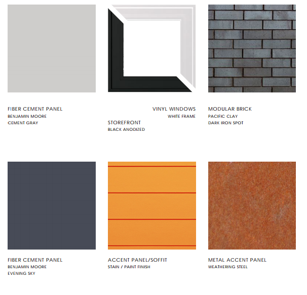
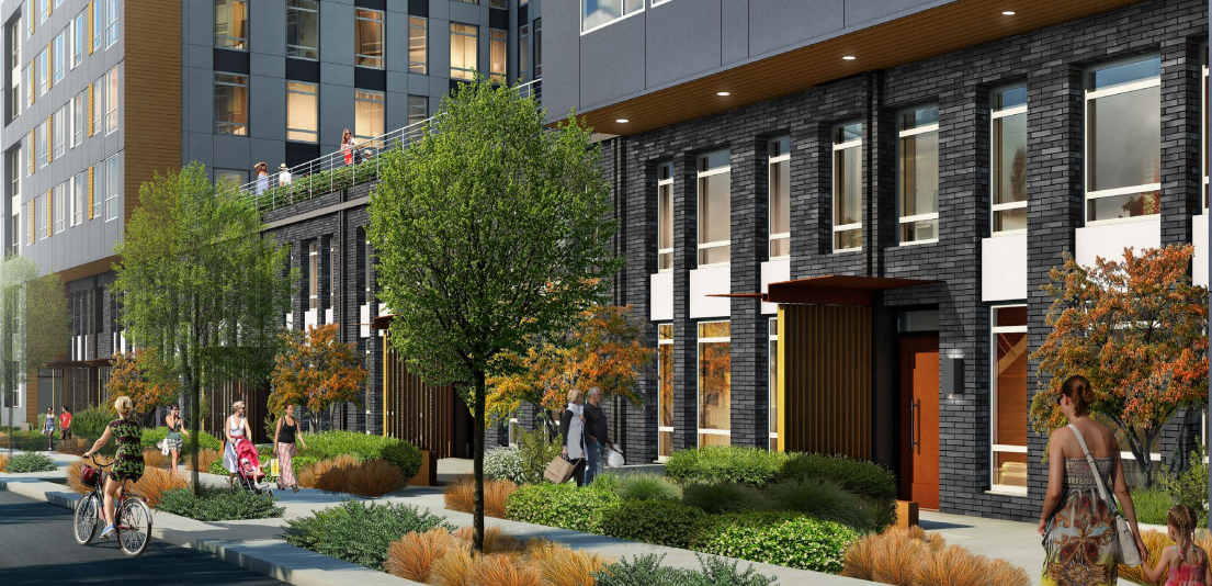
Somehow, despite the massing and length of the building, the overall structure does not seem particularly tall or bulky. Yet, the Dravus, when built, will stand at eight-stories and extend nearly one full block. That’s an impressive feat given that the building has no true stepbacks nor a second facade design. Instead, architects have implemented clever design techniques like cantilevering upper floors, opening up space above the second floor, and creating targeted recesses. Together, these techniques have lessened the bulk and made the building feel multi-dimensional. But targeted material choices and color palette have also enhanced the structure design. For instance, four primary color and material choices were selected for the building, including: iron colored brick, an orange siding soffit, an evening sky (greyish-blue) paneling, and white paneling.
Lennar is joining a local trend in building ground-floor townhouse units as part of larger multifamily developments. These unit types can work well at the base of apartment buildings in lieu of other active uses like retail and restaurants. For Lennar, it was about targeting different demographic segments of the rental market with another housing choice. The townhouses utilize a very different design approach from the upper floors of the residential block.
Entries to the townhouse units come with semi-private spaces. Landscaping features make this distinction in a subtle yet comfortable way from the sidewalk edge. Orange steel canopies cover entryways to townhouse units. Interestingly, the canopy covers have a ribbed wall that rises from ground to canopy to create additional privacy to the semi-private realm between side-by-side townhouse entryways . Meanwhile, the townhouse facade consists of black brick veneer with plate glass window sections that differ in width section to section. The window depth is high. Breaking the window column in half, white paneling sits at the cornice of the first floor.
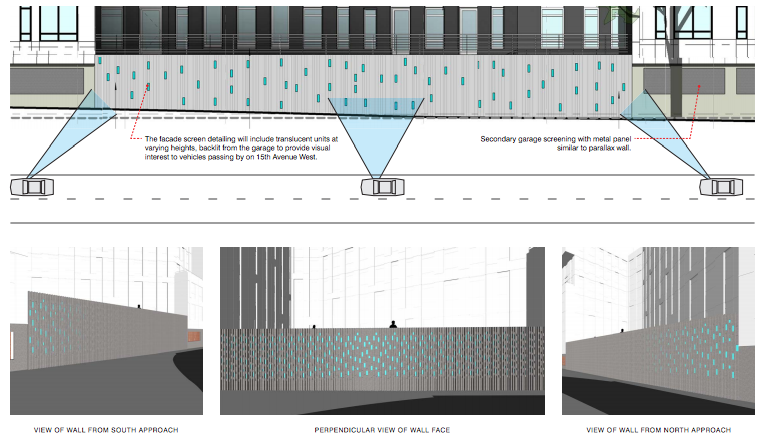
Perhaps one of the more striking attributes of the development proposal is the parallax wall. The 15th Ave W facade would receive this special artistic treatment. The parallax, Bellissimo explained, is “[a] series of openings within a ribbed wall that will create a ‘moire effect‘, whether one passes the building by foot or by car.” Essentially, the parallax would appear to dance and dazzle as people move past the wall due to the undulating ribbing of the wall and the blue titles within the ribs. It’s a visually stunning feature that should enhance what would otherwise be a blank and inactive lower facade, in part because of the parking garage behind the wall. The effect will be best viewed by motorists, however, since their fast movement lends to quicker repetition of the tiles.
Rounding out the project design are proposed streetscape enhancements to both frontages, garage parking, and rooftop amenities. The best streetscape treatment is along 16th Ave W where the townhouse units will front. The combination of semi-private space and planter strips should create a wonderful walking experience. The main entryway at the southwest corner of the building will be hardscaped and landscaped more or less as a plaza, which will strongly identify as a focal point for residents to gravitate to. That space will mimic many of the same attributes of the semi-private spaces of the townhouses. 15th Ave W hasn’t been forgotten though. The Dravus will deliver a greatly improved frontage there with the sidewalk being placed behind the planter strip (part of the way) instead of immediately abutting the street. And as noted before, the parallax will be located on this frontage giving those who walk by something to admire.
The design also capitalizes on the alley to largely hide the three floors of parking. The garage entry will be from the alley meaning that motorists will have to wrap around W Bertona St to the north before continuing down the alley to enter the garage; motorists could also exit to the 15th Ave W ramp as well. It’s a good design though since it will mostly keep cars away from pedestrians and leave the main frontage unobstructed by vehicular access.
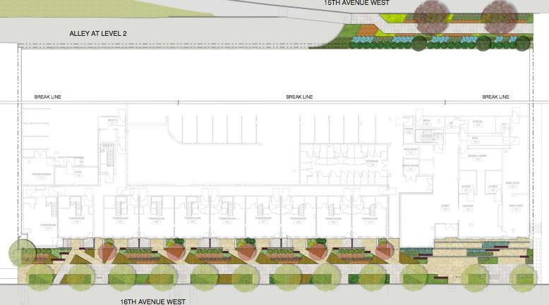
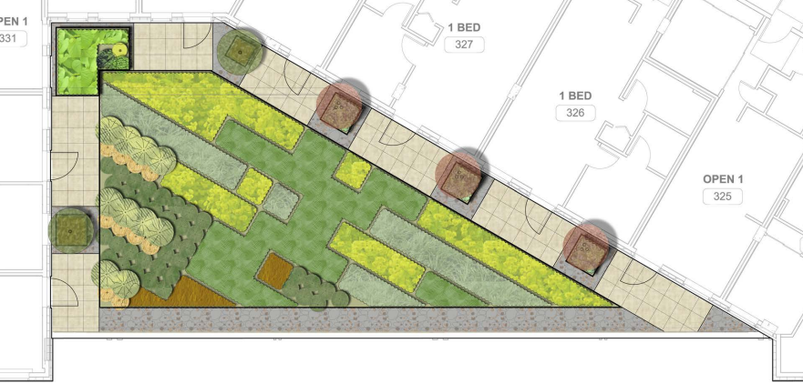
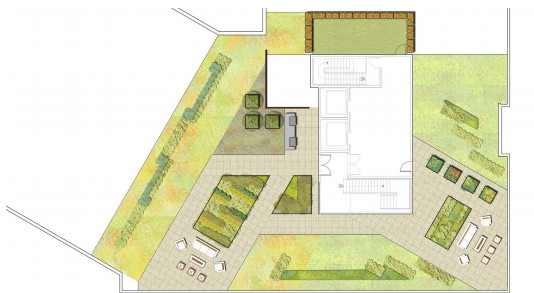
Finally, the building will be getting three roof top amenities. The first two are courtyards placed on the first and second floor; one toward the east of the building and another toward the west of the building. They both sit at the edges of the building and are shaped as right-angled trapezoids. These courtyards are what give the build its “Z” shape since the space above is unobstructed; the building form naturally follows. Meanwhile, the Dravus will feature a roof top terrace above the eighth floor. The views should be spectacular from this vantage point from Downtown to Elliott Bay and back on up to Ballard and Salmon Bay. And for the trainspotters out there, Balmer Yard should be a source of constant interest.
So now that two projects are moving forward in Interbay, what’s next for this crossroads community?
Stephen is a professional urban planner in Puget Sound with a passion for sustainable, livable, and diverse cities. He is especially interested in how policies, regulations, and programs can promote positive outcomes for communities. With stints in great cities like Bellingham and Cork, Stephen currently lives in Seattle. He primarily covers land use and transportation issues and has been with The Urbanist since 2014.


