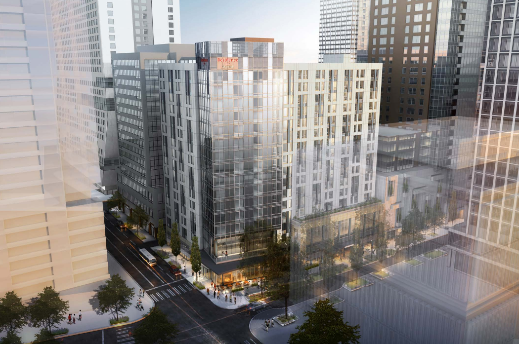
A new hotel project could soon be breaking ground in what used to be a no-mans-land on the edge of Downtown Seattle. The Stonebridge Companies, a global hotelier holding company, is planning a 17-story building at the corner Howell Street and Terry Avenue. The site is ideally suited for a hotel use given its proximity to Downtown and the fact that a massive expansion of the Washington State Convention Center is in the early planning stages a mere block to the south.
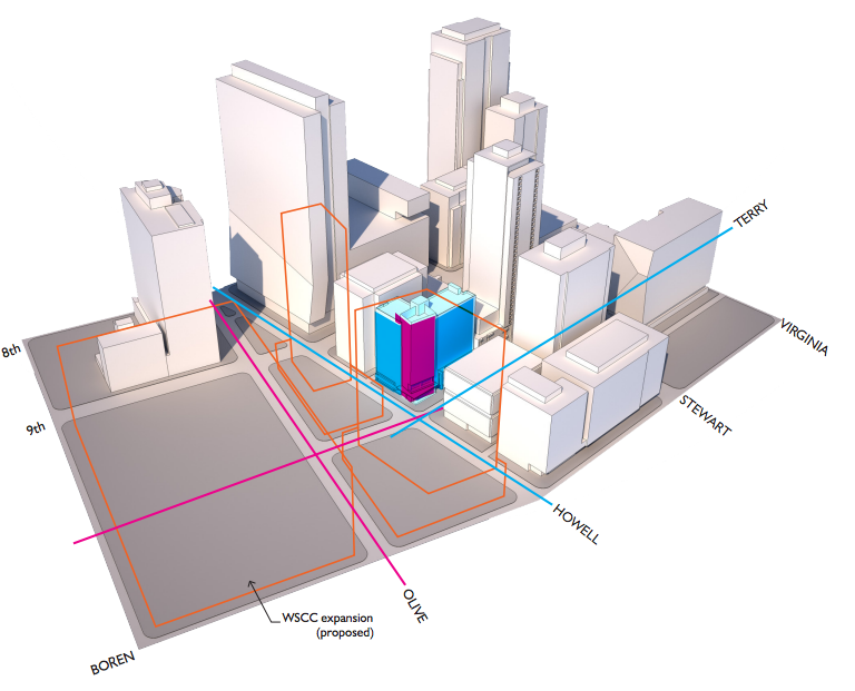
Stonebridge wants to establish a new extended stay hotel with 309 rooms under the company’s Residence Inn by Marriott brand. The building will also feature ground floor retail, a restaurant, conference space and amenities, and 139 parking stalls below ground. To develop the project plans, Stonebridge has hired local architects Weber Thompson to lead the project through the city design review process.
At an earlier stage, the project design was pitched with a deeply simple architectural approach reminiscent more of a contemporary office building than a modern hotel. Few distinguishing features were presented in the project renderings, but attempts were made to breathe some life into the building. A curtain wall of windows and paneling were the central points of design with blue glazed windows framed by white columnar panels along the vertical length of the building. To add more diversity in the design, the corner was to be broken with fully glazed windowing and no framing to dress up the windows.
But architects at Weber Thompson have stepped it up in the latest design proposal by putting more visual interest in fenestration, the corner massing, and the podium. Renderings show that the corner massing will be slightly angled from the rest of the structure to set it apart from the primary massings to the west and north. The subtle angle will be noticeable from the street, but what will perhaps be more interesting to passerby is the color and materials of the massing. Glass will colored in different tones of grey and form irregular modules horizontally — that is to say, the pattern will vary horizontally, but be consistent from top to bottom of the massing. Capping the top of the the massing will be a parapet similar to that seen on the new Amazon tower, Rufus 2.0. The parapet will serve to screen rooftop mechanical equipment while also increasing the verticality of the structure and prominence of the corner.
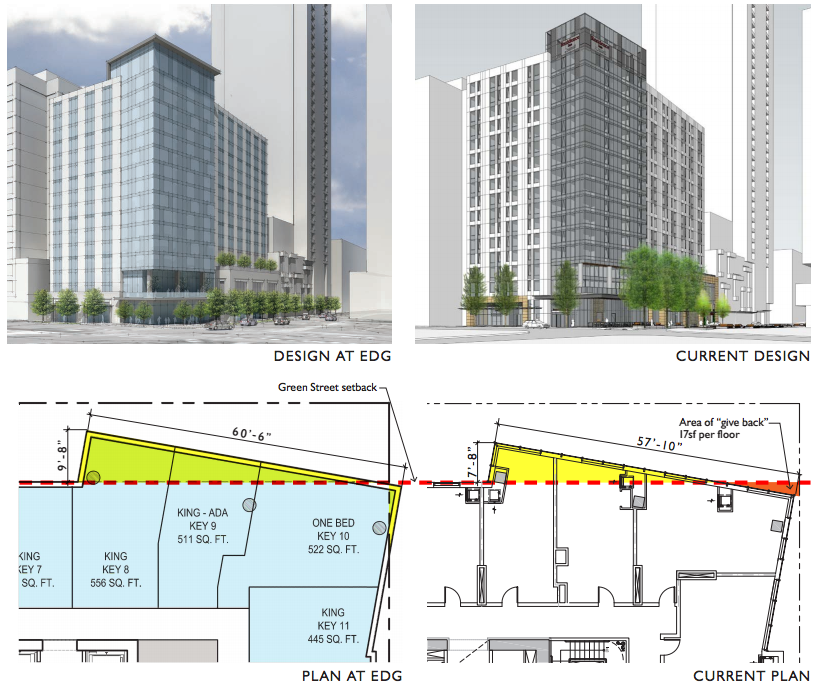
Meanwhile, the other two primary massings will be patterned differently. Verticality is still emphasized in the design, but to achieve this, paneling will play a bigger role over windows. In fact, density of windows is far less than the corner massing. Like the original design, white columns of paneling will be affixed to the facade to create linear verticality, but a patchwork of white and grey panels will frame the areas above and below individual windows. This patchwork approach will create a pattern of H’s, which are most apparent when white. While less marked, the podium at the edges will also get a bit more color. Instead of white stone, architects are planning to add earthy peach stone panels to frame the first two floors of the building.
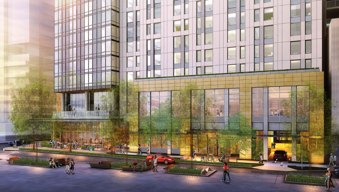
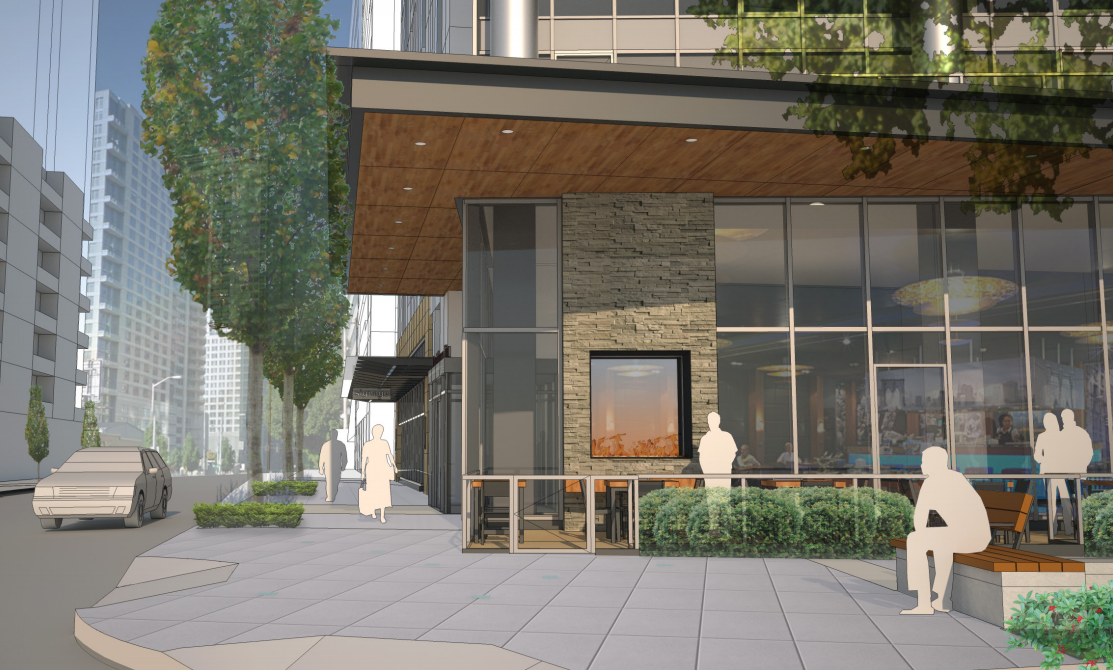
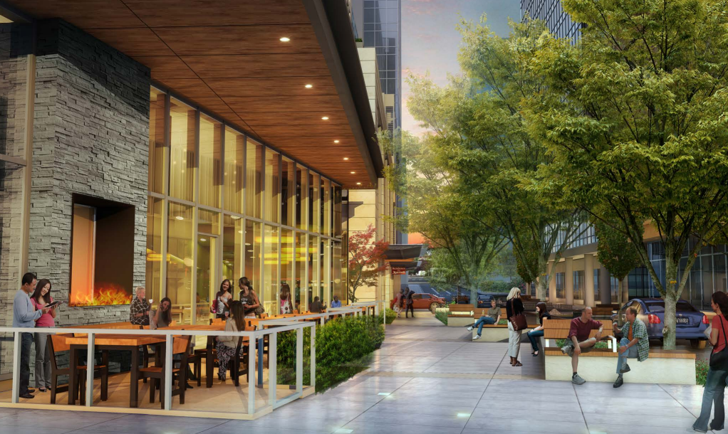
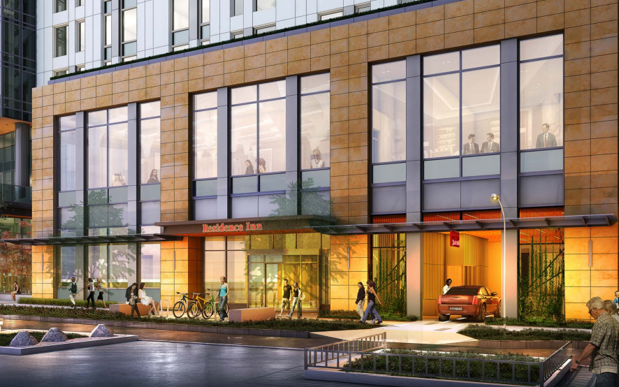
But it’s more than just the facades that the architects hope will create a pleasing building; it’s the ground floor and streetscape, too. As you can see in the images above and below, a lot of the design work is going into creating an intimate streetscape. Terry Avenue will get the most attention given that it is designated as a Green Street.
The restaurant space at the ground floor will casually mix with the pedestrian space along the edges of Terry Avenue and Howell Street. To soften up the edges and warm it up, a large outdoor fireplace, viewable from the sidewalk, and low-laying landscaping would blend the walking and sitting spaces together. Just beyond this, sittable furniture for the general public will be interspersed along the very green planter strips.

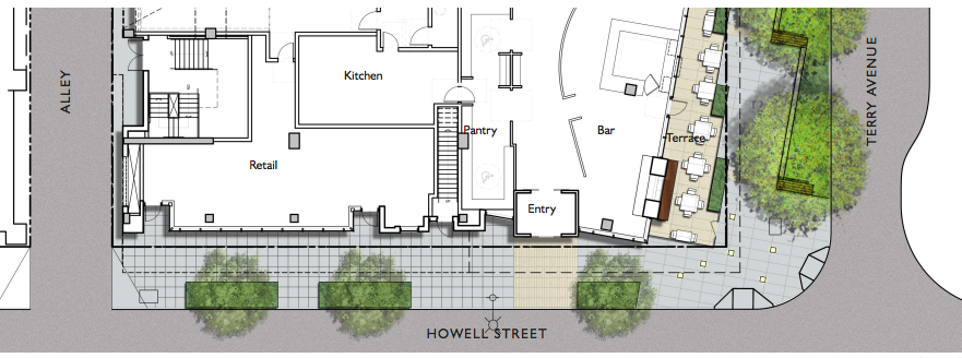
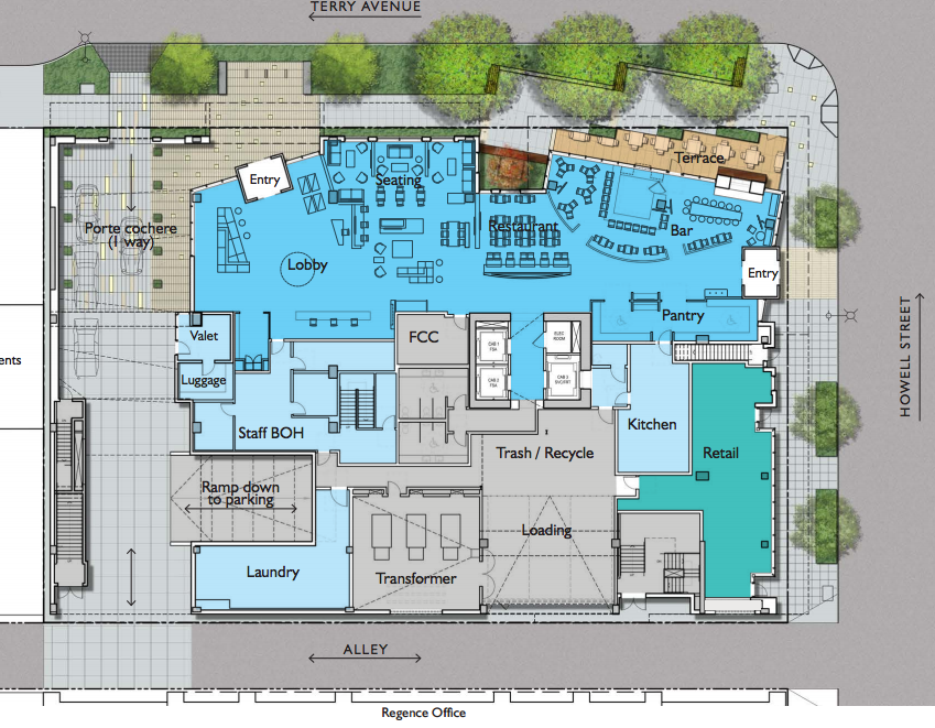
From the frontages, the building does not appear to be highly complex. But take a look at the ground floor plans and you’ll see that there’s a lot going on. Retail will form a small portion of the building along Howell Street and transition into the restaurant space at the corner. Basic building services are hidden behind both while guest services form the north half of the ground floor, including the lobby, laundry, check-in, elevators, and a porte cochere. Mindful of this guest experience, a special entry has been created further down the Terry Avenue frontage and setback slightly from the street. This entryway also happens to serve guests arriving via the porte cochere.
The architects have trimmed down the prominence of the porte cochere by dressing up the entryway from Terry Avenue while also thinning it down. Drivers will be able enter into the building via the porte cochere to drop off luggage and guests near the main entryway. Afterward, they may either proceed back on to one of the main streets via the rear alleyway or avail of the valet parking services. This arrangement is a good solution to onsite traffic management by creating safer traffic circulation. Traffic is pushed away from potential conflicts near the intersection as proposed, and pedestrians and cyclists are less likely to be impacted by vehicles crossing the sidewalk due to vehicle access being restricted to entry-only off of Terry Avenue. General traffic, however, will operate via the alleyways with bidirectional traffic. But given the ample sight triangles to and from the alleyways, conflicts with pedestrians and cyclists should be minimal, too.
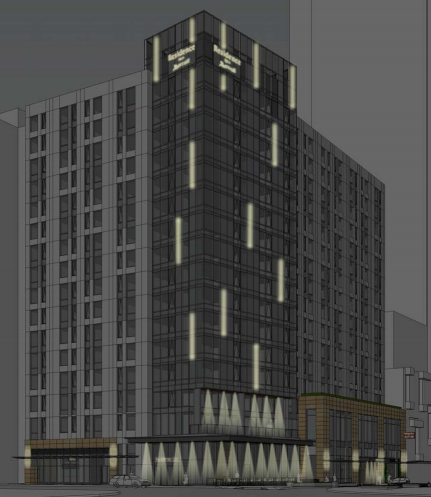
At first glance of the renderings, lighting is not so evident as a feature. But upon closer examination, it is the subtle cleverness of how the architects plan to program lighting throughout the project that might be most the most thrilling aspect of it. In the image above, solid singular lights are planned at the edges of the podium while a heavy presence of downward light will be focused near the corner. This makes a lot of sense given that the restaurant and lobby are likely to be the most active parts of the building after dark. Yet, the more striking light is just above the bottom floors of the building. Along the corner massing, long stripes of white-yellow lights will dance across the facades to reinforce the the tallness of the building and importance of the block.
The street, too, will get a lighting treatment. Small square lights will dot the corner of Terry Avenue and Howell Street as well as the pedestrian entrance further down the Terry Avenue frontage. The porte cochere will receive a lighting pattern similar to the corner massing with long striped lights between stone pavers.
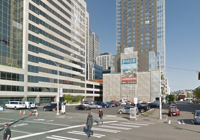
If you’re wondering what’s at the site today, the answer is: not much. All that occupies the site is a surface parking lot, which is highly typical of the area — though admittedly becoming rarer and rare with redevelopment in the area. Neighboring buildings to the project site are four towers: Aspira, 1800 Nineth, 1007 Stewart, and Seattle Vault Self-Storage. But it’s easy to see how the project will fit well within this block and become a bright beacon for a growing district.
How To Get Involved
If you’re interested in attending the community design review meeting for this project, you can do so tomorrow (August 18) evening. The Downtown Design Review Board will meet at City Hall in Room L280, located at 600 Fifth Avenue. The design review meeting will begin promptly at 5.30pm. Alternatively, if you wish submit comments in written form, you can do so by e-mailing Magda Hogness, Project Planner, at Magda.Hogness@seattle.gov and the Department of Planning and Development (DPD) at PRC@seattle.gov.
For more design review materials and upcoming meetings, see DPD’s design review page.
Stephen is a professional urban planner in Puget Sound with a passion for sustainable, livable, and diverse cities. He is especially interested in how policies, regulations, and programs can promote positive outcomes for communities. With stints in great cities like Bellingham and Cork, Stephen currently lives in Seattle. He primarily covers land use and transportation issues and has been with The Urbanist since 2014.


