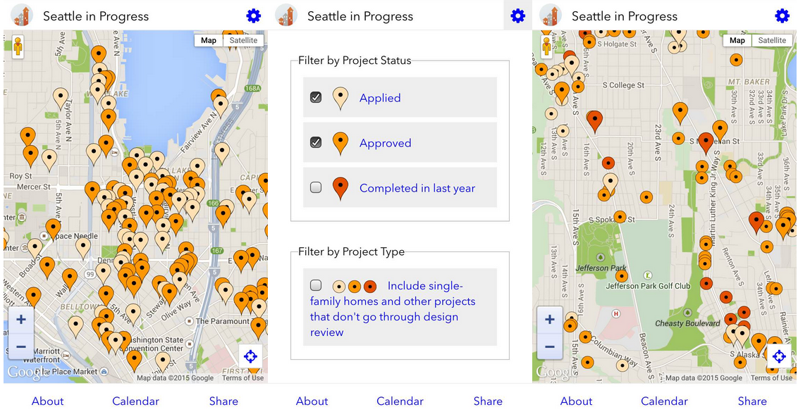
When Seattle In Progress was launched back in November, it was a revolutionary way for locals to be in-the-know on development projects across Seattle. Our good friend Ethan conceived the app service as a way to get people engaged in the planning process, and to help them know what could end up on street near them in the future. Using data from the City of Seattle’s Department of Planning and Development, the app displays key information on projects. Tapping on a pin reveals the location, a preview picture of the project, a way to receive notifications, and a description of the proposal. Users can also choose to review the latest design review packet in full via PNG image scrapes.
But now five months on, Seattle In Progress has gotten a significant update.

The most obvious change within the user interface are the pins. Now colored by project status, it’s easy to tell if a project is under review (yellow), approved (orange), or completed (red). It’s also possible to see projects that don’t undergo design review like small additions, tenant improvements, or new single-family homes. To change what appears on the map, users can toggle the new filter box (gear icon in the upper right corner).
If you want to follow the progress of new and current projects, be sure to add Seattle In Progress to your Twitter and Facebook timelines. Or, if there are specific projects of interests, you can always subscribe to them via the Seattle In Progress pages.


