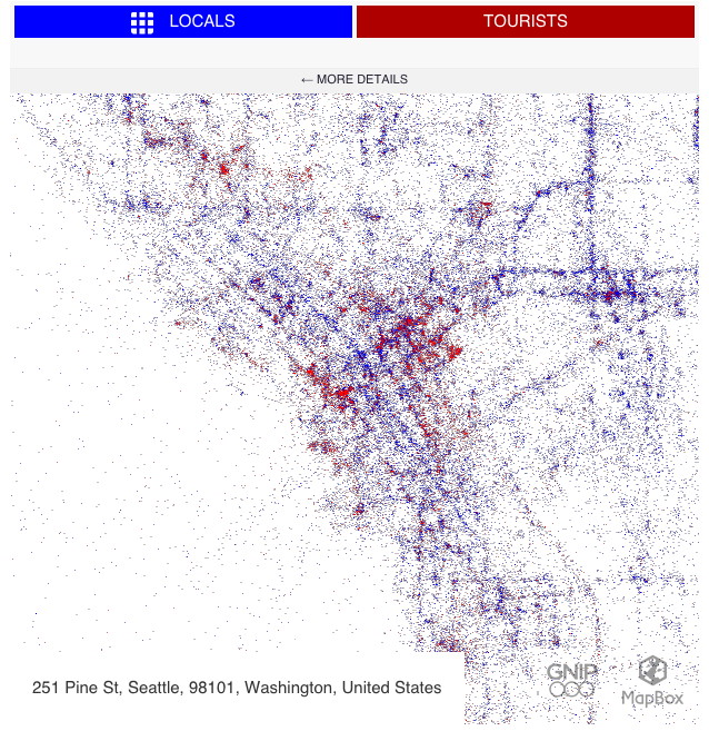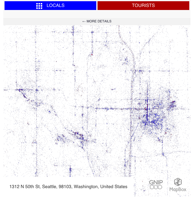
Who knew you could make beauty out of tweets? Data and map guru Eric Fischer recently released a series of maps via Mapbox called “Locals & Tourists“. The interactive map allow users to search for their favorite places around the globe to see what areas are popular with the locals and tourists alike. CityLab explains how it works:
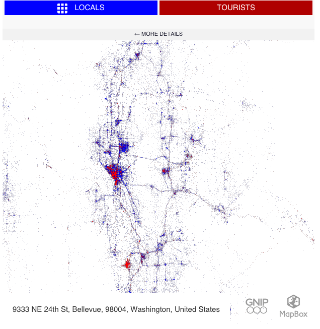
Using Gnip’s archive of geo-tagged tweets from September 2011 through May 2013, Fischer designated “locals” as those who’d been tweeting from the same city region for one month or longer. Their tweets are blue spots on the map. “Tourists” (red spots) were those who’d been tweeting in that city for less than a month, and who seem to be “locals” in another city.
Remarkably, the tweet-points are not overlaid onto an existing world map; rather, they manifest into recognizable urban geographies. This becomes apparent when you zoom in tight or all the way out: neighborhood, county, and national boundaries simply aren’t there. In these maps, the world is a sum of its tweets.
As you can see above, places in and around the Convention Center, Seattle Center, and Pike Place Market are very popular with tourists while the places in between and Capitol Hill are home to the locals. That doesn’t seem all that surprising. But taking a step back to look regionally, Bellevue stands out with a very high density of tourists. Presumably this has to do with many business travelers, but could Bellevue Square also be a draw like Southcenter in Tukwila? The biggest red blotch of them all is the airport. With so many visitors coming and going daily, this is exactly what we would expect.


