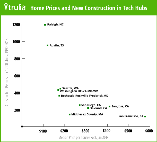
If you are concerned about housing costs, you should know that building a lot more housing will be critical to control or reduce costs. We previously discussed a graphic that showed how the cost of homes seemed to correlate with the number of permits for new housing. You can see the article here and the graph here:

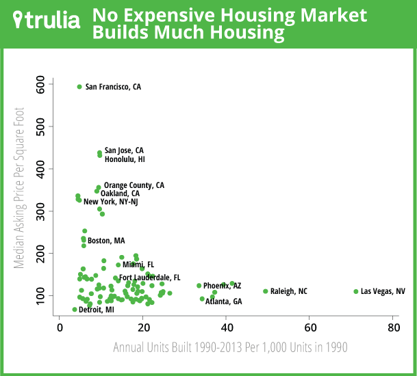
This graph is by no means unassailable proof that housing costs are causally related to the number of permits issued. To really prove a causal relationship, we need a lot more research. We are lucky because Trulia recently produced another, even better graph, regarding housing costs. Specifically, the research shows that cities with a lot of growth and very little new housing have higher housing costs. On the flip side, cities with a lot of growth that build more housing have lower costs.

Cities that are closer to the top of the graph are more expensive while those on the bottom are less expensive. Cities on the right built a lot more housing relative to their size, while those on the left built a lot less. There are three immediate observations to note from this group:
- All the cities that built the most housing have the lowest cost of housing.
- All the cities with the highest cost built very little housing over the 13-year period.
- There are no cities that built a lot of housing and have high costs.
What the graph does best
The scatter plot is really remarkable for its empty space. While it is common to get push back that building more housing doesn’t reduce housing costs, people often imply or state explicitly that more housing actually drives up costs. The Trulia graph shows in stark constrast that there aren’t any places that build a lot of housing and have high cost. There is a giant white space above $150 per square feet and to the right of 20 units built annually.
What’s lacking
This graph isn’t proof that building more housing is a cure-all for housing costs. There are a lot of intricacies to note, including:
- Only the cost of homes for sale are shown, not rental prices.
- No single graph can prove causality. For example, the areas that built a lot more housing (Raleigh and Las Vegas) have other commonalities that may be the underlying cause of their low housing costs (i.e. they are sprawling cities).
- There are a lot of cities on the graph that built more housing than other cities but have higher costs. This is because the graph doesn’t illustrate the connection between population growth and housing cost.
I’ll do my best to address the latter two points.
Proving causality
How could someone prove that building more housing helps reduce costs?
First, it makes sense to see if this assertion fits a general understanding of how prices are set. In this case, we would point towards Econ 101, showing that prices are connected to supply and demand. When there is more demand than supply, prices go up. As an example, the most recent lime shortage. The price of limes increased tremendously because there weren’t enough for all our margaritas and now we are stuck with lousy lemons.
A general understanding of Econ 101 isn’t good enough though. There are many quirks in economics that are easily missed if we ideologically adhere to the most elementary talking points. Proof requires evidence. That’s why the two graphs above are so important. Both graphs indicate that building more housing is correlated with lower costs. When a correlation is found over and over again, it is very likely a causal relationship. Especially if there is no evidence indicating there isn’t a correlation (and good luck finding evidence that refutes this argument).
The evidence presented here isn’t comprehensive (and isn’t meant to be). We only mean to show two graphs that illustrate the correlation between the amount of housing and the cost of housing. If you are sincerely interested but skeptical of this argument, there is a lot more research out there for you to read*.
Population growth and the dots on the bottom left
The graph clearly doesn’t show a singular and direct connection between building housing and increased costs. In fact, the graph shows San Francisco at the very top and Detroit at the very bottom, even though it appears that San Francisco built more housing than Detroit. This would suggest there is another factor and that factor is almost definitely population growth.
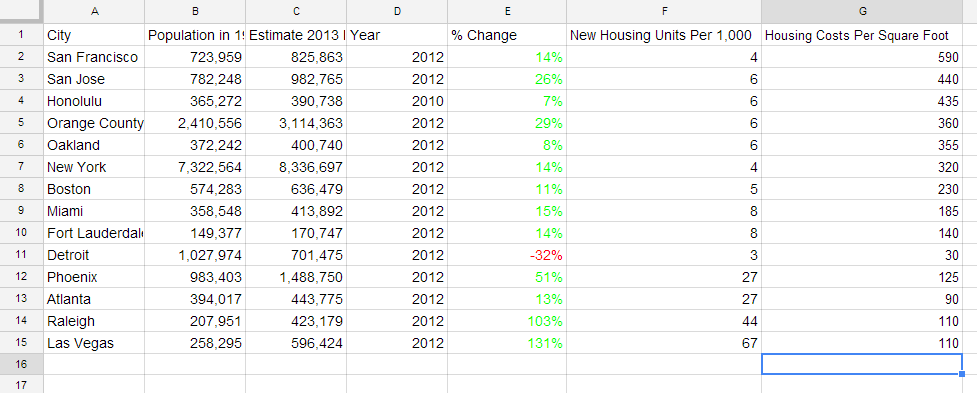
To better understand the last point, I want to show how different areas have grown. I was able to find the population in 1990 and 2012** for most of the incorporated areas of the cities with labeled points*** (Honolulu is different****). I then took my best guess at the number of new units per 1,000 and square foot costs that the points on the graph represent. Here’s a view of what I found:

Looking at this data it seems pretty clear that cities can avoid higher prices even when growing rapidly by adding a lot more housing. The two cities with the most growth also added the most housing and kept their home prices low. This also helps explain why housing is so much more expensive in San Francisco than Detroit. While San Francisco grew, Detroit saw an incredible decline in population.
Looking at this closer also provides a less obvious but important insight. The growth of a city and the amount of housing the city adds doesn’t appear to entirely explain the costs of housing. These factors clearly account for a lot of the explanation, but it seems there are other factors at work as well. To demonstrate this point:
- Orange County and San Jose had very similar rates of growth and added nearly the same amount of housing. In fact, Orange County grew 3% more than San Jose. Even those factors are so similar, housing prices are 20% lower per square foot in Orange County.
- New York and San Francisco grew the same percent and added nearly the same amount of housing, but New York’s housing prices are significantly lower.
The most obvious objections to these last points is that my numbers are estimates. It would be necessary to get the precise area that Trulia is measuring to know the precise population changes. Still, this information can lead us to ask an important question, what other factors might affect the cost of housing.
Admitting we don’t have enough housing
Even if we admit supply and demand might not explain costs entirely, it is still clear that we must build more housing. The correlation between the amount of housing built and the cost is extremely strong. If housing prices increase we’ll cause a great deal of pain and suffering. Not enough housing increases everyone’s costs, causes massive displacement, creates sprawl, furthers environmental degradation, and increases segregation.
From the understanding that we will need a lot more housing, we can begin discussing the more complicated question of how to build that housing. It is typical for conversations to conflate these two points. Many people (including myself sometimes) confuse the question of whether or not to build more with how to build more. Some common arguments used to fight more housing include; complaints about design, vigorous pointing to vacant lots as proof there isn’t demand for housing, exclamations about the immense ‘capacity’ of our current zoning, examples of gentrification ruining our city, and stories about displacement. None of these arguments suggest we shouldn’t build more housing. Instead they are complaints about how we build more housing. Once we explicitly acknowledge we need development, we can begin figuring how to build enough.
*I don’t want to imply I’ve read all these research papers. I just know they are out there and would enjoy feedback from someone that has had the time to look at them closely.
**2012 was chosen because that’s the most recent updated data provided by the Census Bureau. This doesn’t match the time frame perfectly for the Trulia data, but it matches pretty closely.
***Census data is for incorporated areas only (Orange County being the only exception). Data is for the city of New York City exclusively rather than the entire New York metropolitan area, although the graph is likely representing more than just the incorporated city. To give the best data, it would be important to know the area Trulia is measuring and match that to population growth; unfortunately, that’s not possible.
****Honolulu doesn’t have updated 2012 statistics from the Census Bureau’s website.

Owen Pickford
Owen is a solutions engineer for a software company. He has an amateur interest in urban policy, focusing on housing. His primary mode is a bicycle but isn't ashamed of riding down the hill and taking the bus back up. Feel free to tweet at him: @pickovven.


